PRODUCT
Microwave Sponge Pot
PRODUCT DESCRIPTION
Mr Clitring – 2 Moist Flaps
Two Moist Flaps. Hot, sticky and ready in minutes.
Two individual syrup sponge puddings with a soft, moist crumb and rich golden sauce, ready to heat and serve.
PUBLIC RESPONSE
Customer Reviews
★★★★★
An exquisite moist and wonderfully soft treat. I like to warm mine gently before sticking a finger in to taste it.
Sylvie Wanque, Lyon
★★★★☆
A lovely little pudding. Mine was warm, sticky and slightly open at the top. My boyfriend surprised me with a load of his custard.
Carol Gimp, Widnes
★★★★★
Very satisfying after dinner. I like a hot one oozing with sweet juices ALL OVER MY FAT COCK.
Oscar Cuntgate, Doncaster
PRODUCT INFORMATION
Nutritional Information
| Typical values | Per 100g | 2 × portion (42g) |
|---|---|---|
| Energy | 1981 kJ / 473 kcal | 832 kJ / 199 kcal |
| Fat | 19.8g | 8.3g |
| of which saturates | 3.4g | 1.4g |

BEHIND THE LABEL
INSIDE THE DESIGN
REAL WORLD DETAILS
Origins
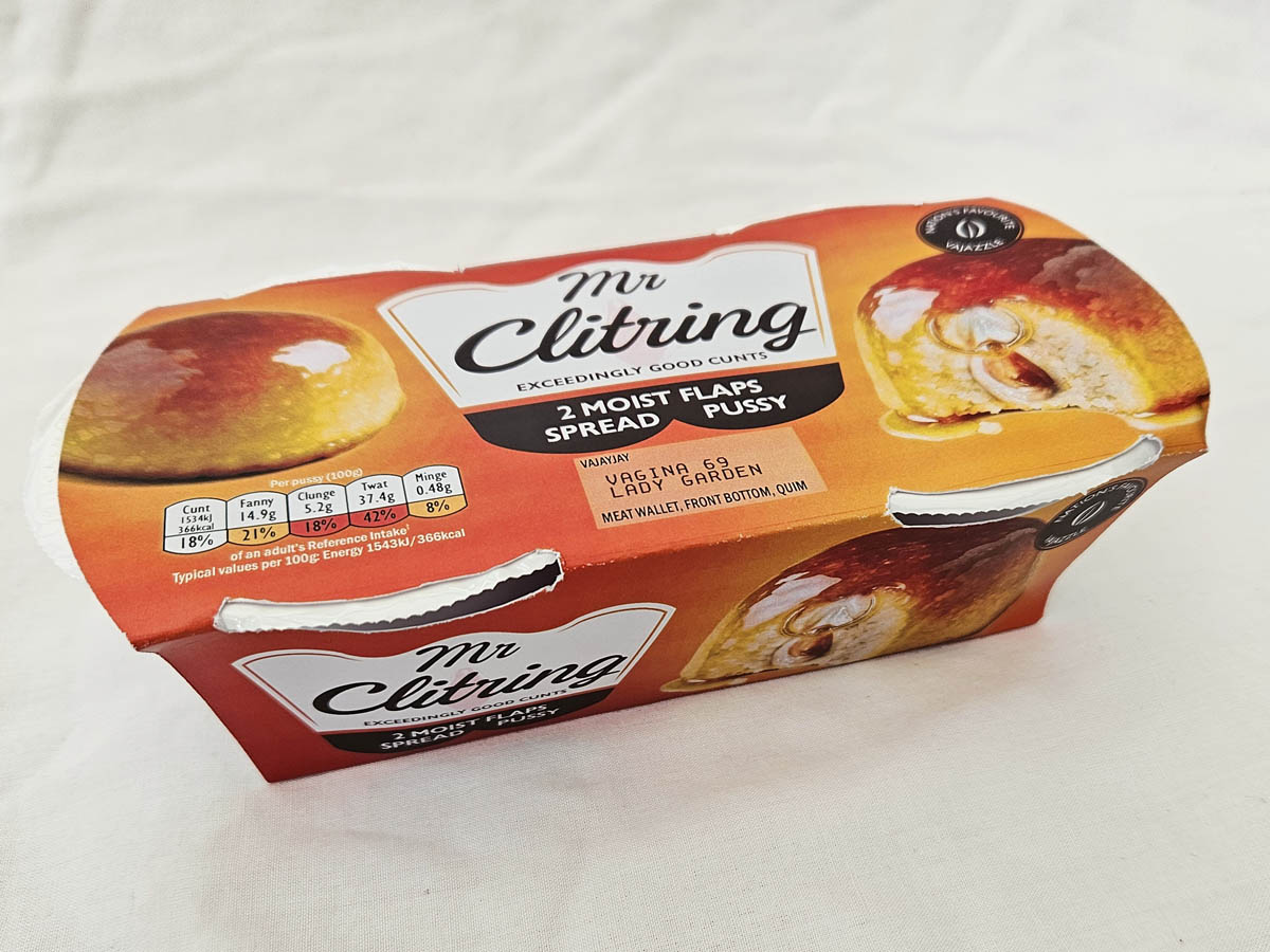
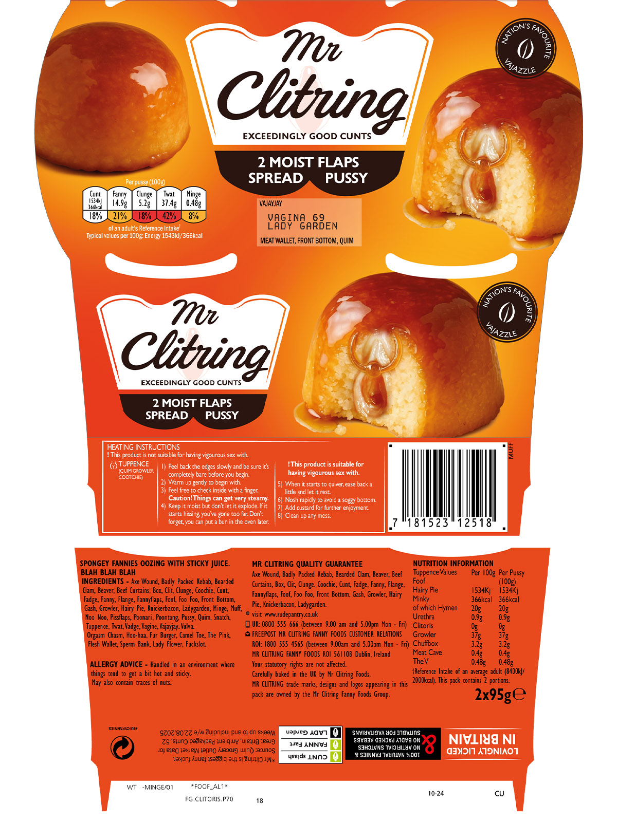
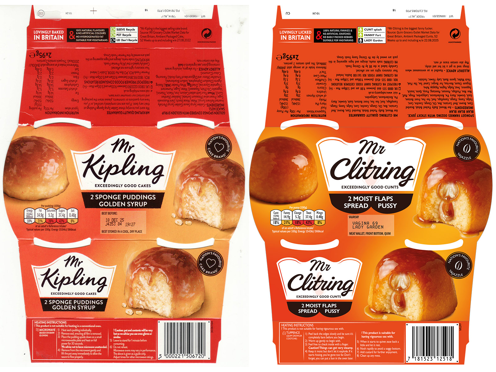
Outer packaging for microwave sponge pots.
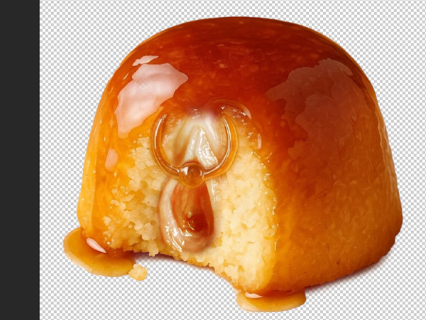
Mostly photo imagery, so I knew I’d have to fashion a sponge or use AI imagery. But AI is so prudish and strictly controlled, it won’t even generate imagery of oysters.
Full Design
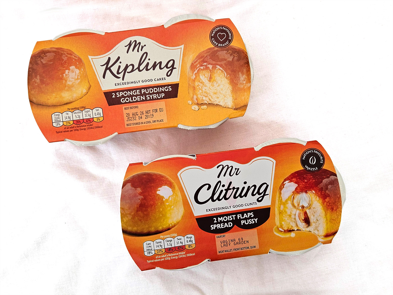
Original vs Rude Pantry Version
| Original Product | Rude Pantry Product | |
|---|---|---|
| Parent Company | Premier Foods Group | Rude Pantry |
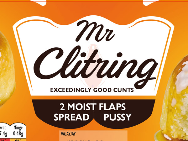
| Brand | Mr Kipling | Mr Clitring |
| Product Name | Sponge Puddings | Moist Flaps |
| Variety | Golden Syrup | Spread Pussy |
| Dominant Theme | A dessert sponge with golden syrup | A sponge with a vulva and clitoris ring. |
| Barcode Numbers Spell | 5000221506720 | 7 18 15 23 12 5 18 = GROWLER |
| Barcode Scans As | Mr Kipling Golden Syrup Sponge Puddings 2 x 95g | GROWLER |
Comparison
Development & Detail
In the Wild
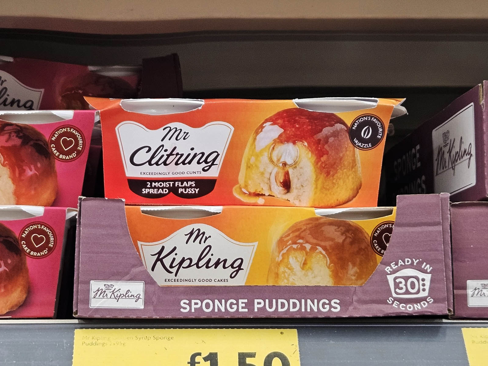
Photographed in the supermarket.