PRODUCT
Soup Sachet
PRODUCT DESCRIPTION
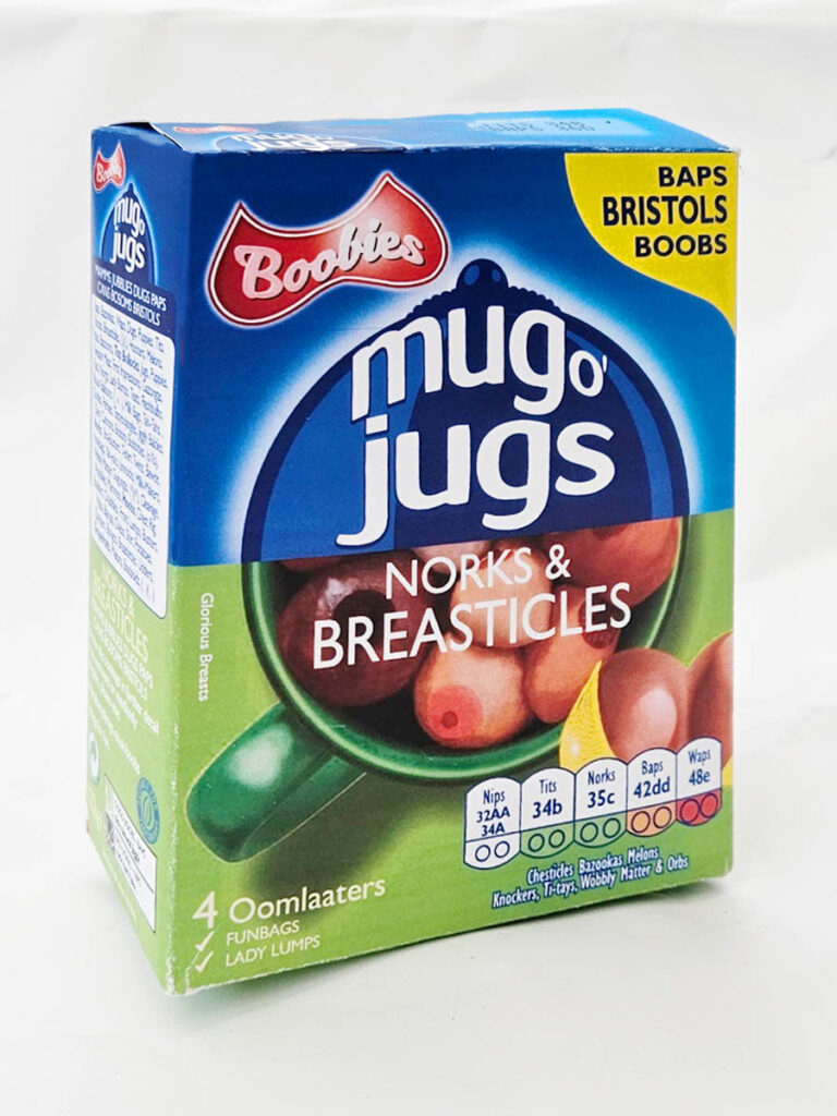
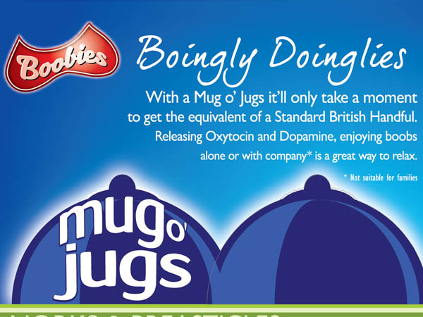
Boobies Mug o’ Jugs – Norks & Breasticles
Four steaming mug-fulls of proper lady lumps.
Instant soup with a rich, savoury flavour and smooth, warming finish.
PUBLIC RESPONSE
Customer Reviews
★★★★★
Wonderfully creamy and surprisingly substantial. I took mine to bed and spent a very pleasant ten minutes with both hands underneath for support. Very comforting on a cold night.
Femmke van der Bollock, Rotterdam
★★★★☆
Delicious, hot and slightly salty, just how I like mine. Smooth to the lips and extremely satisfying once you get stuck in.
Veronica Bum, Rotherham
★★★★★
Lovely colour and very inviting. I went for a larger cup and was glad I did. Quite a mouthful.
François Nips, Bedford
PRODUCT INFORMATION
Nutritional Information
| Typical values | Per 100g | 2 × portion (42g) |
|---|---|---|
| Energy | 1981 kJ / 473 kcal | 832 kJ / 199 kcal |
| Fat | 19.8g | 8.3g |
| of which saturates | 3.4g | 1.4g |

BEHIND THE LABEL
INSIDE THE DESIGN
REAL WORLD DETAILS
Origins
Outer box for instant soup sachets.
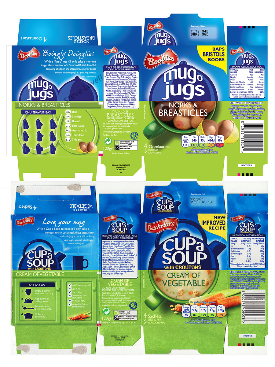
As with a lot of food packaging, the original is bright, colourful and visually busy. That made it a good candidate for a complete Rude Pantry rebuild rather than a simple front-label joke.
Full Designs
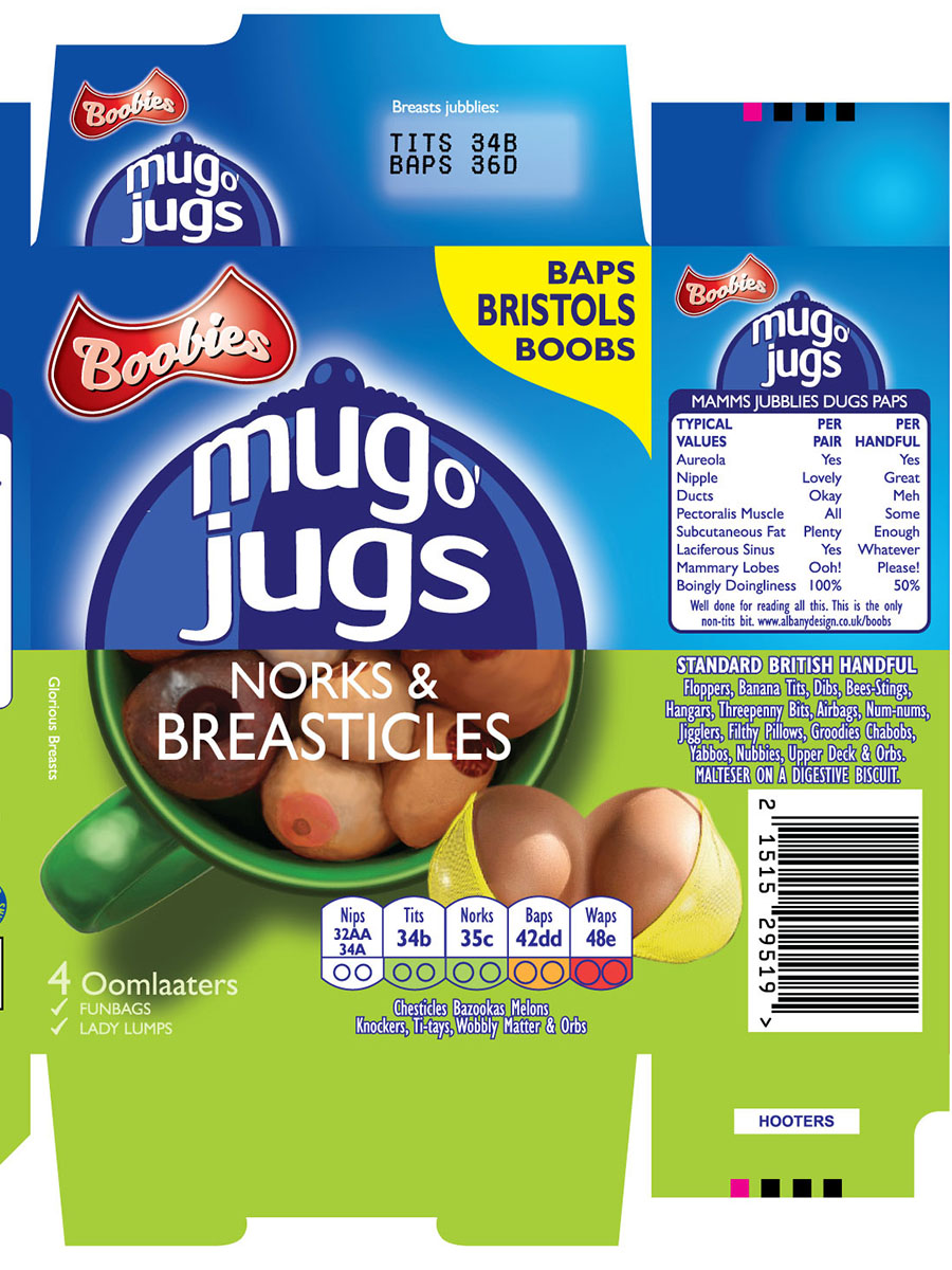
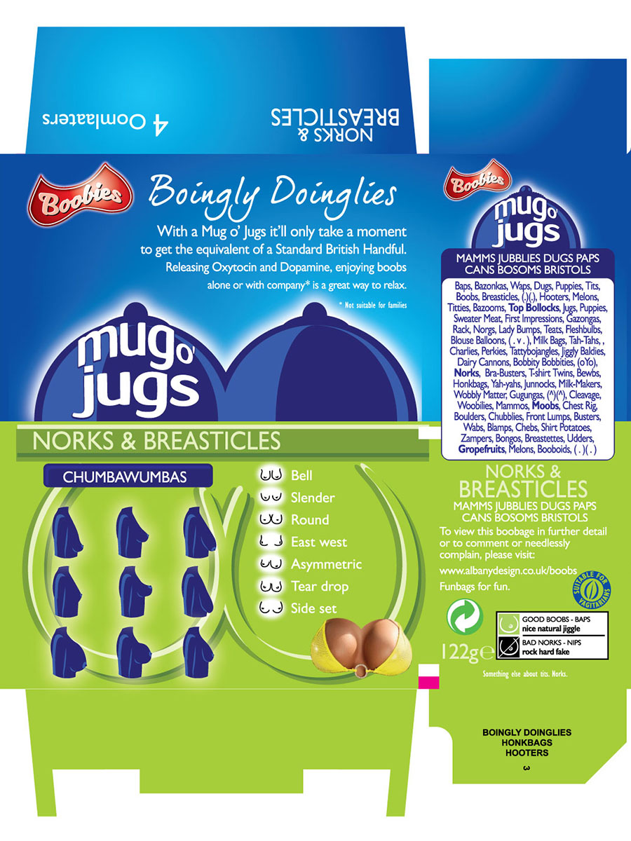
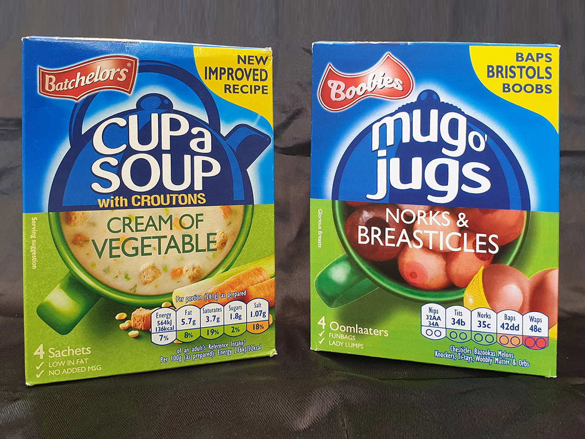
Original vs Rude Pantry Version
| Original Product | Rude Pantry Product | |
|---|---|---|
| Parent Company | Premier Foods Group | Rude Pantry |
| Brand | Batchelors | Boobies |
| Product Name | Cup a Soup | Mug o’ Jugs |
| Variety | Cream of Vegetable | Norks & Breasticles |
| Dominant Theme | Vegetable soup; box shows half a kettle and half a cup of soup | Breasts |
| Barcode Numbers Spell | 5000175409078 | 2 15 15 2 9 5 19 = BOOBIES |
| Barcode Scans As | Batchelors Cup a Soup Cream of Vegetable with Croutons 4 Sachets | TITS |
Comparison
Development & Detail
In the Wild
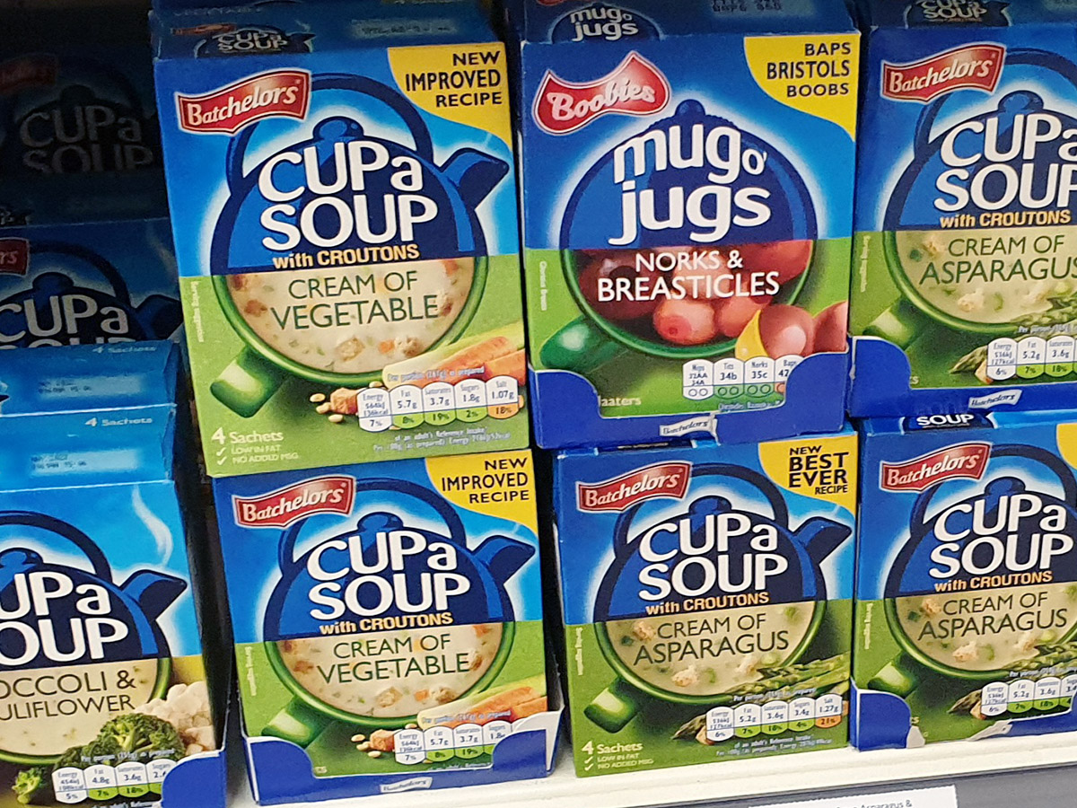
This was the first product I took to a supermarket to photograph on the shelf. Taking it out of a bag was fine. Putting it back looked considerably more like shoplifting.