PRODUCT
Spiced Rum Bottle
PRODUCT DESCRIPTION
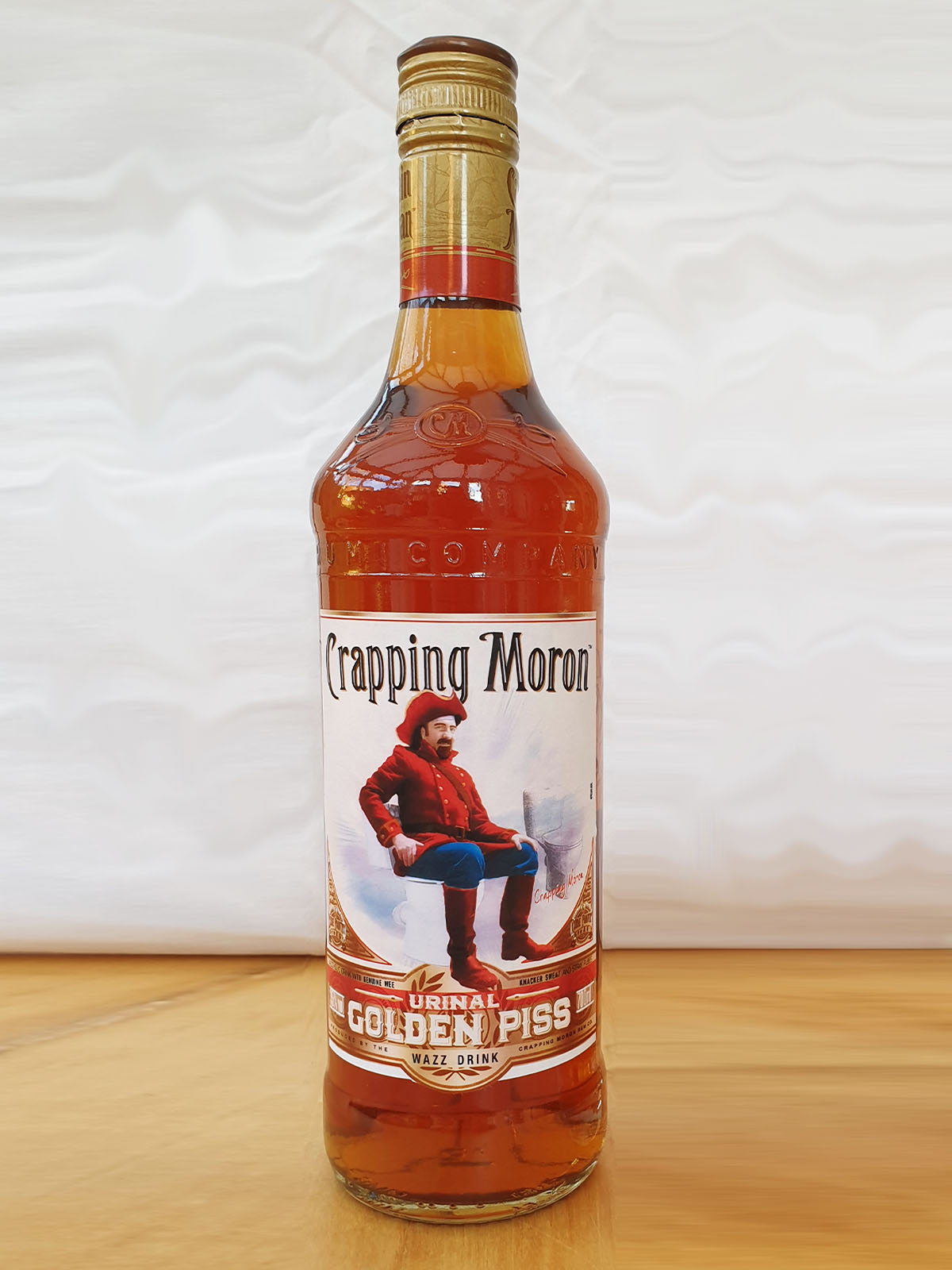
Crapping Moron – Urinal Golden Piss
For those who like their Piss golden, well-spiced and served by the measure.
A 700ml golden spiced rum at 35% ABV, with a smooth, warming character, gentle sweetness and a lingering touch of spice.
PUBLIC RESPONSE
Customer Reviews
★★★★★
Rich, warming and very smooth. I particularly enjoy a large stiff one while I’m on a bender.
Philip Jism, Outwood
★★★★☆
A lovely rum. It’s good to get couple of fingers in me. Straight up.
Samantha Muffhouse, Leigh
★★★★★
A fine drink. My wife enjoys a little liquor before bed. And I’m only 5′ 7″.
Alexander Taint, Loughborough
PRODUCT INFORMATION
Bottle Information
| Bottle details | Specification | Value |
|---|---|---|
| Volume | Bottle size | 700ml |
| Strength | Alcohol by volume | 35% ABV |
| Style | Spiced rum | Golden |

BEHIND THE LABEL
INSIDE THE DESIGN
REAL WORLD DETAILS
Origins
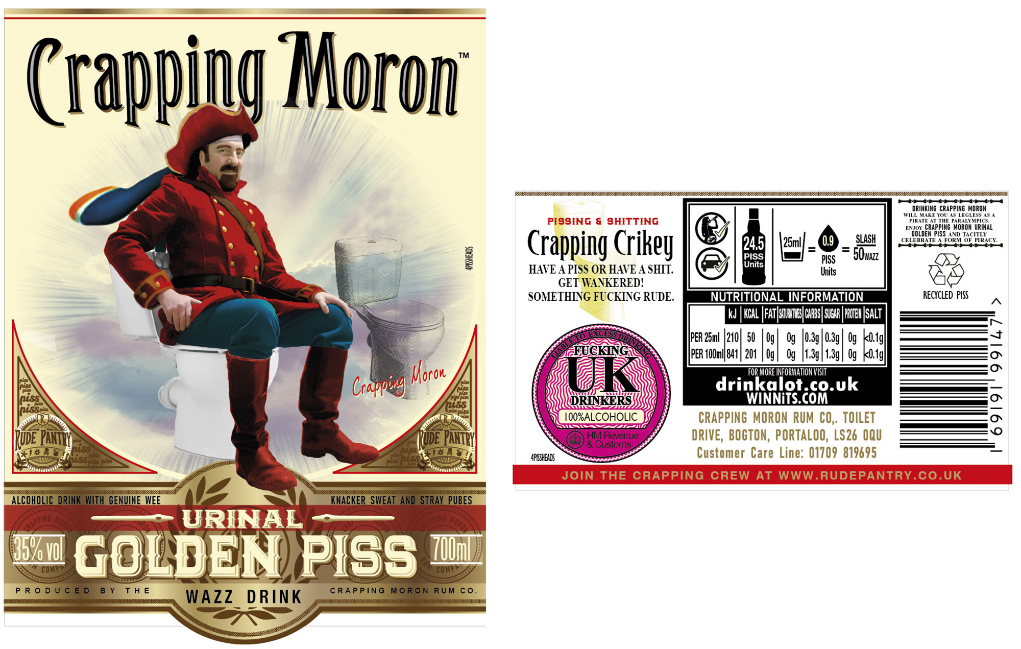
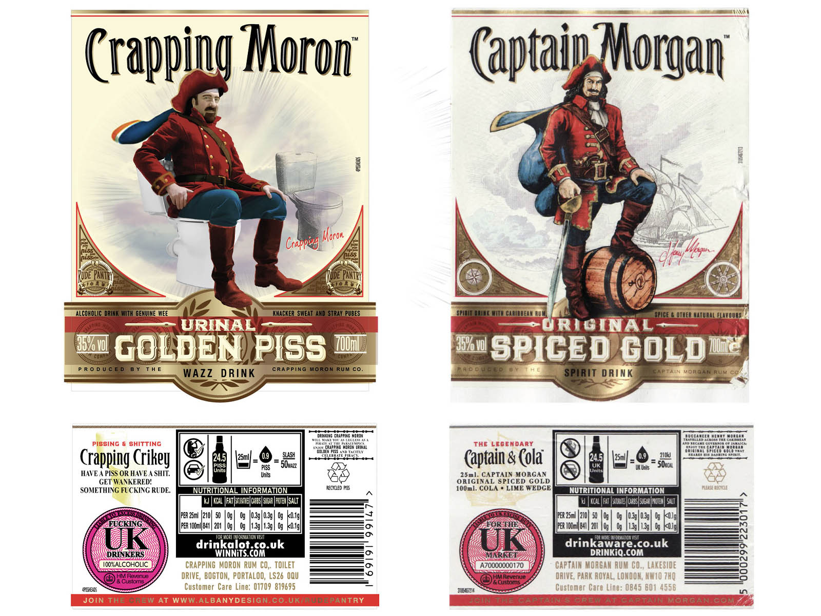
Front and rear labels for Spiced Rum Bottle.
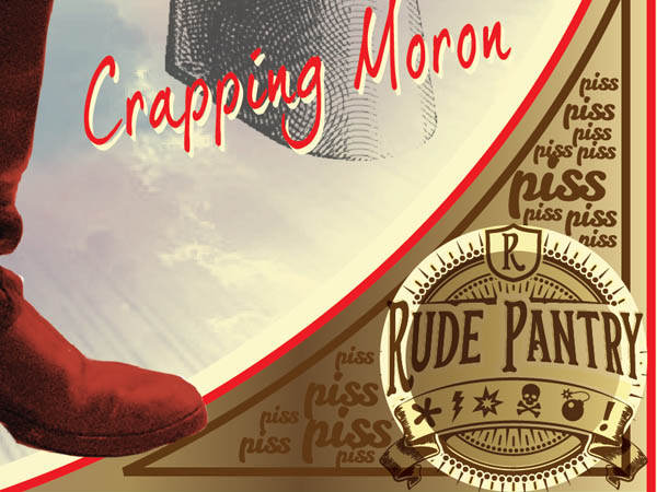
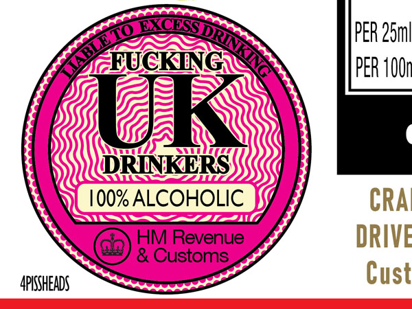
There was an awful lot more small detail than I first considered.
Full Design
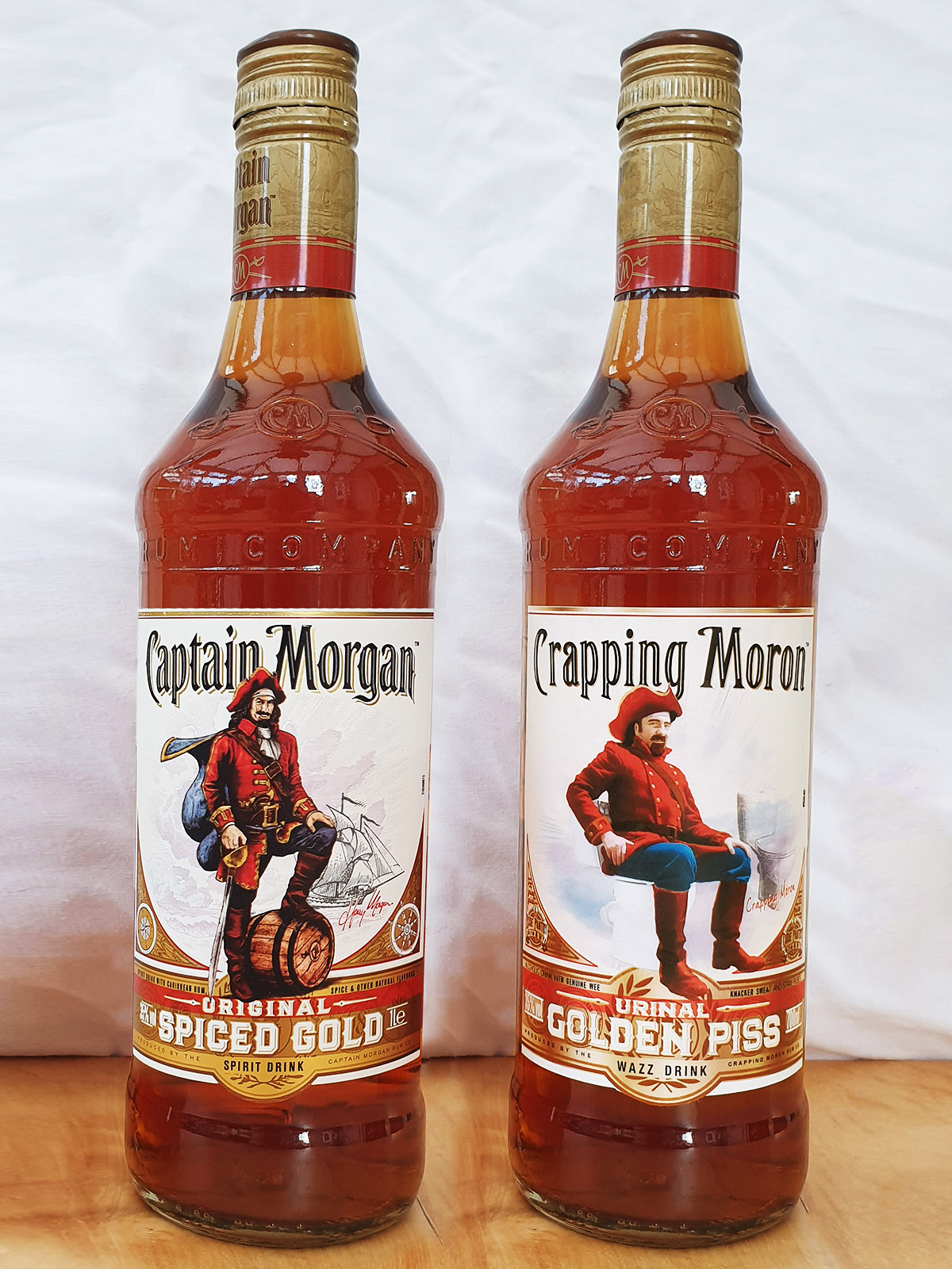
Original vs Rude Pantry Version
| Original Product | Rude Pantry Product | |
|---|---|---|
| Parent Company | Captain Morgan Rum Co. | Rude Pantry |
| Brand | Captain Morgan | Crapping Moron |
| Product Name | Spiced Gold | Golden Piss |
| Variety | Original Spiced Gold | Urinal Golden Piss |
| Dominant Theme | A stylish flamboyant Captain rests his foot on a barrel with an etched ship at sea in the background | Urine. And a moron on a toilet, with an etched toilet. |
| Barcode Numbers Spell | 5000299223017 | 16 9 19 19 9 14 7 = PISSING |
| Barcode Scans As | Captain Morgan Original Spiced Gold 700ml | PISSING |
Comparison
Development & Detail

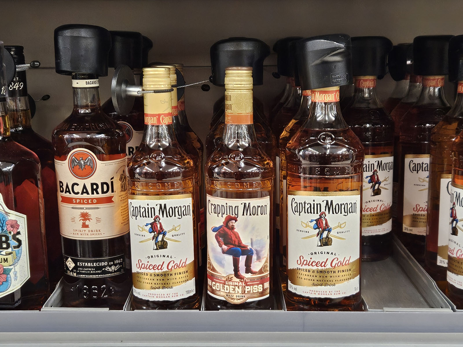
In the Wild
Photographed in the supermarket in 2025, so the label design had changed after 4 years.