
PRODUCT
Chocolate Cereal Bar
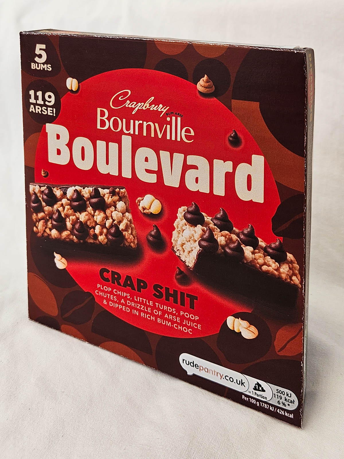
PRODUCT DESCRIPTION
Chocolate Cereal Bar
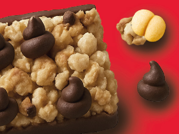
Crapbury Bournville Boulevard Bars are chewy, wholesome cereal snacks made with a blend of oats, wheat flakes, bran flakes, and crisped rice, drizzled with honey and dipped with rich dark chocolate.
PUBLIC RESPONSE
Customer Reviews
★★★★★
Customs confiscated mine because Belgium classifies “Crap Shit” as a stool sample. Still giving four stars.
Javier Pillock, Madrid
★★★★☆
One of my plops was upside down. Completely spoiled the realism.
Mark Bastard, Twatt
★★★★★
I keep one in my handbag in case I need to shame an enemy.
Laura Gash, Scarborough
PRODUCT INFORMATION
Nutritional Information
| Typical values | Per 100g | 2 × portion (42g) |
|---|---|---|
| Energy | 1981 kJ / 473 kcal | 832 kJ / 199 kcal |
| Fat | 19.8g | 8.3g |
| of which saturates | 3.4g | 1.4g |

BEHIND THE LABEL
INSIDE THE DESIGN
REAL WORLD DETAILS
Origins
Box for chocolate coated cereal bars.
As with a lot of food packaging, the original is bright, colourful and visually busy. That made it a good candidate for a complete Rude Pantry rebuild rather than a simple front-label joke.
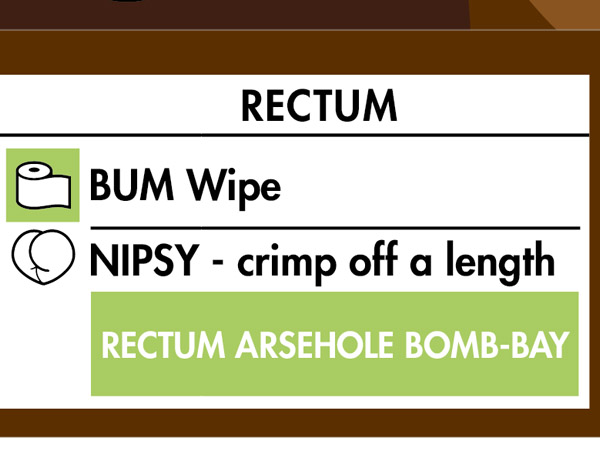
The name “Bournville Boulevard” is a humorous euphemism for anus, rectum or anal passage.
Full Design
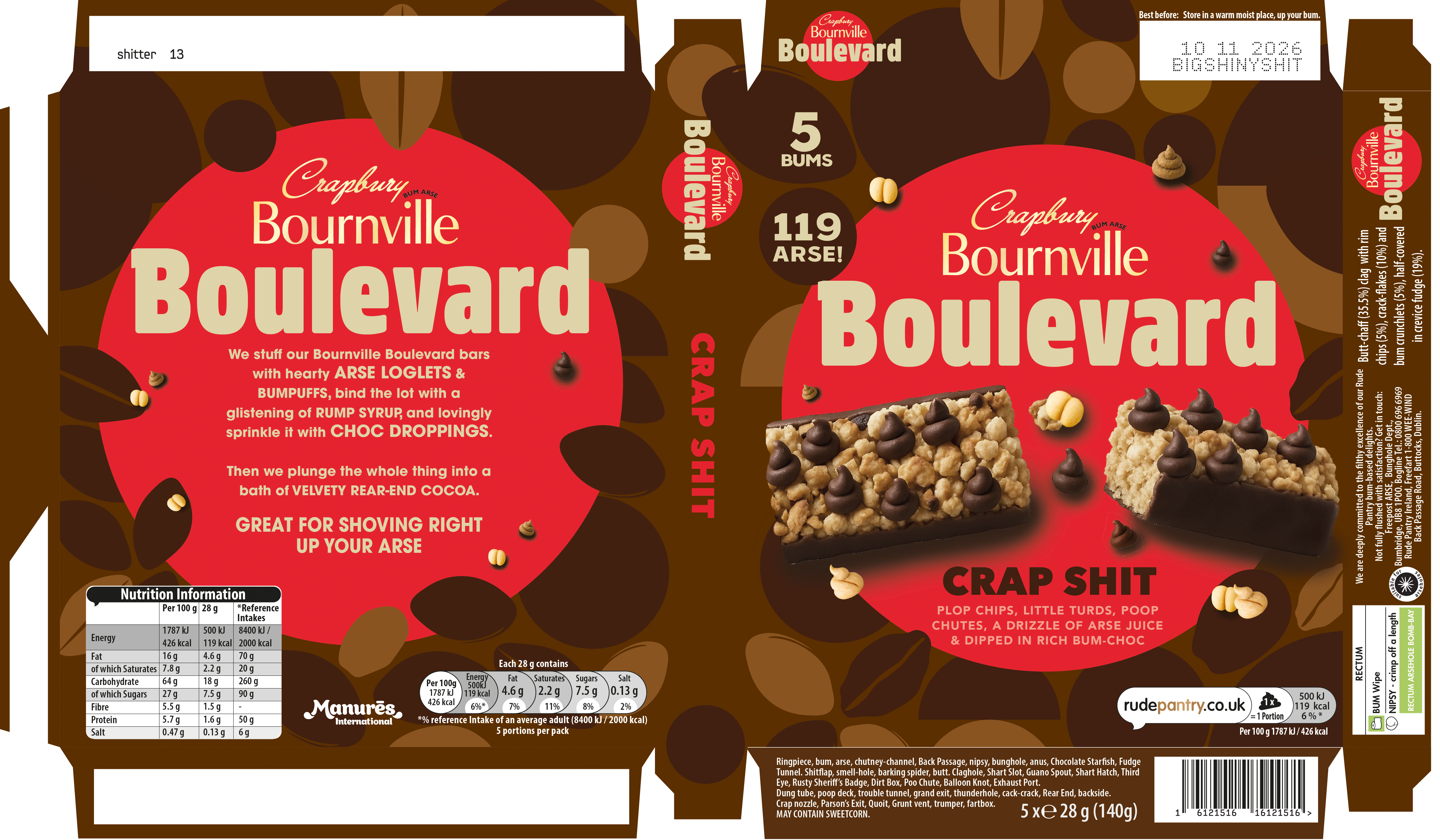
Original vs Rude Pantry Version
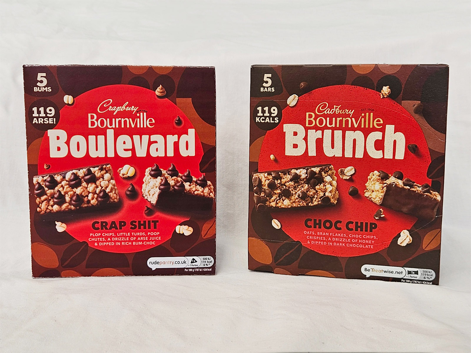
| Original Product | Rude Pantry Product | |
|---|---|---|
| Parent Company | Mondelez International | Rude Pantry |
| Brand | Cadbury | Crapbury |
| Product Name | Bournville Brunch | Bournville Boulevard |
| Variety | Choc Chip | Crap Shit |
| Dominant Theme | Chocolate dipped cereal bars with choc chips | Excrement |
| Barcode Numbers Spell | 7622202219245 | 16 12 15 16 16 12 15 16 = PLOP PLOP |
| Barcode Scans As | Cadbury Bournville Brunch Choc Chip with Croutons 4 Sachets | Plop plops |
Comparison
Development & Detail

In the Wild
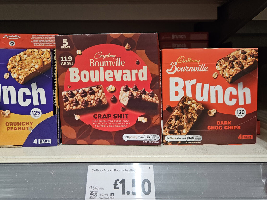
Unhelpfully, by the time I got round to taking a photo on the supermarket shelf, they’d changed the packaging design.
Notes
Unusually, the word “Bournville from the original remained. because it served the rude jokey name.