PRODUCT
Crisps Tube
PRODUCT DESCRIPTION
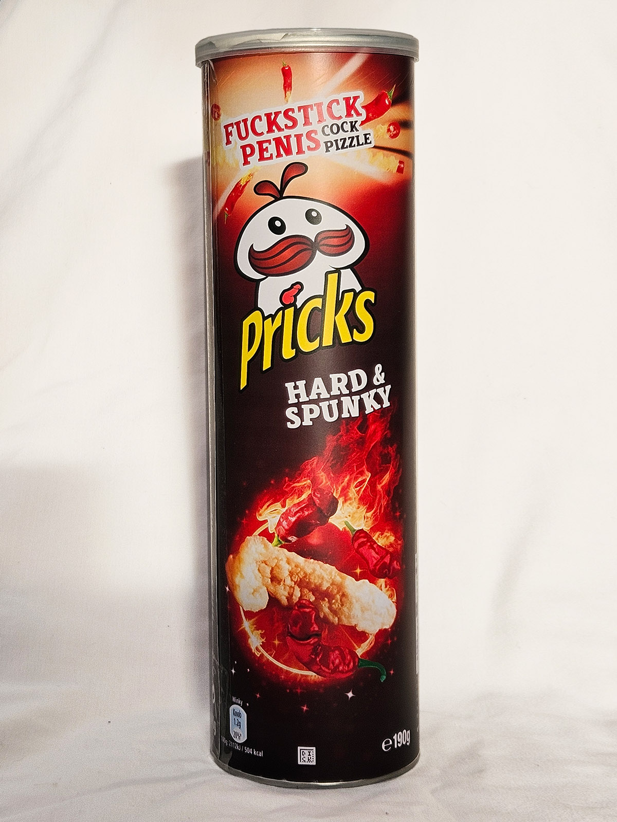
Pricks – Hard & Spunky
For the discerning snacker who expects their Pricks hard, hot and packed firmly into a tube.
A reassuringly premium tube of chilli-seasoned potato crisps with a firm crunch and steadily building heat. Savoury spices, tomato powder and cayenne pepper extract give a bold, well-rounded flavour with a dry, lingering finish.
PUBLIC RESPONSE
Customer Reviews
★★★★★
Properly spicy potatoey delights. Even after I had several different fists inserted repeatedly, my opening still looks remarkably presentable.
Louise Minge, Wetwang
★★★★☆
Excellent crisps. At a recent party, three men whipped out their 12-inch pipes and popped them to everyone’s delight.
Imran Arsehole, Leeds
★★★★★
A tasty treat. My wife gobbled the load before any softening could occur.
Pat McGroin, Liverpool
PRODUCT INFORMATION
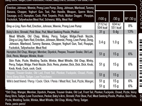
Nutritional Information

BEHIND THE LABEL
INSIDE THE DESIGN
REAL WORLD DETAILS
Origins
Label for tube of crisps.
I knew this one had quite a lot going on visually, but I began it anyway.
Full Designs
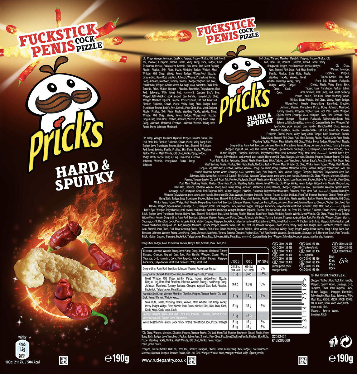
Original vs Rude Pantry Version
| Original Product | Rude Pantry Product | |
|---|---|---|
| Parent Company | Kellanova | Rude Pantry |
| Brand | Pringles | Pricks |
| Product Name | Pringles | Pricks |
| Variety | Hot & Spicy | Hard & Spunky |
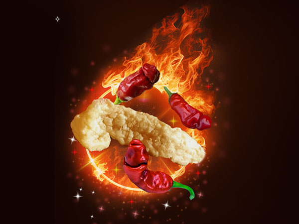
| Dominant Theme | A reconstituted potato crisp with red chillies, flying through a hoop on fire. | A crisp and dick chillies flying through a hoop on fire. And Penises. |
| Barcode Numbers Spell | 5053990123568 | 23 1 14 7 5 18 = WANGER |
| Barcode Scans As | Tuiles Pringles Hot & Spicy – 190g | Winkle |
Comparison
Development & Detail
In the Wild
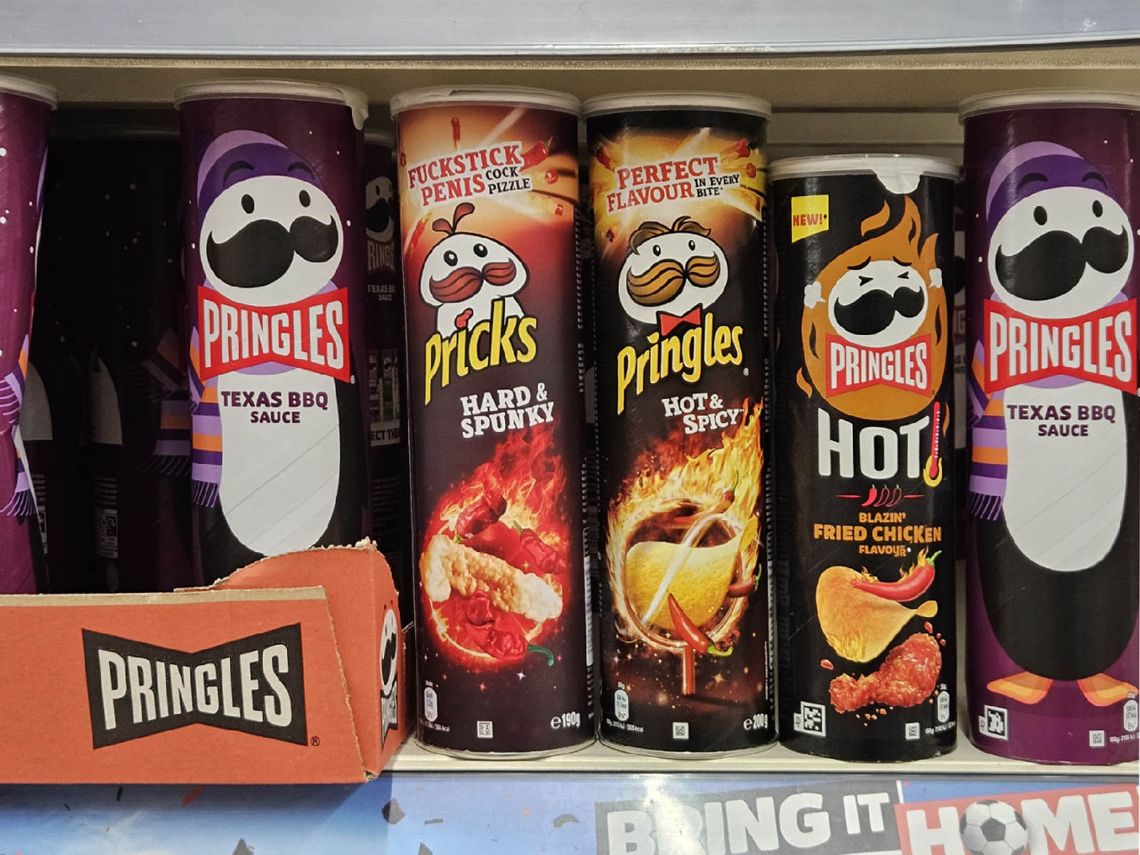
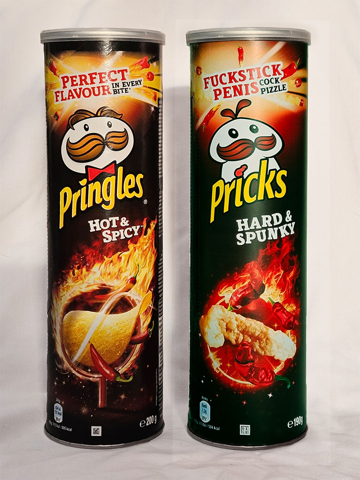
Annoyingly, when I made this, I didn’t even know they’d already changed the packaging design. I think they made them more boring.
Here, I sneaked in the old empty packaging and my version to sit aside the new versions.
And they don’t even do hot and spicy ones now. They’ve got “Chilli and Lime” or “Blazin’ Fried Chicken”. No thanks.