

OUT OF CHARACTER
Behind the (Beef) Curtain
Everything else on this website is written as though Rude Pantry were a real company. This page isn’t. It’s me explaining how the project started, how I make the work, and why I spend far too long on details most people will never notice.
2012
How It Started
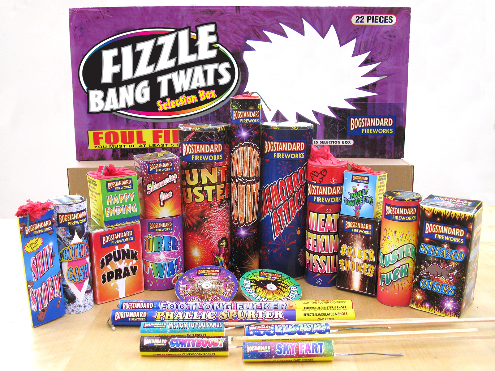
Rude Pantry did not begin as a food project. In 2012, I relabelled an entire box of fireworks. I cannot remember exactly why, although the hyperbolic names given to fireworks probably had something to do with it. You buy something called Apocalypse Thunder Dragon and it produces a short shower of orange sparks and a disappointing pop.
That one-off stayed alone for about eight years. Then, in 2020, I made a fake wine label called Bollock’s Crease, based on Jacob’s Creek, purely for my own amusement. Over the next few months came an instant soup box, a tin of chunky soup, a noodle pot, a cooking sauce jar and a cream liqueur bottle.
By December there were enough of them to need something holding them together, so I created the fictional Rude Pantry identity. It has been expanding sporadically ever since.
THE RULE
Everything Gets Changed
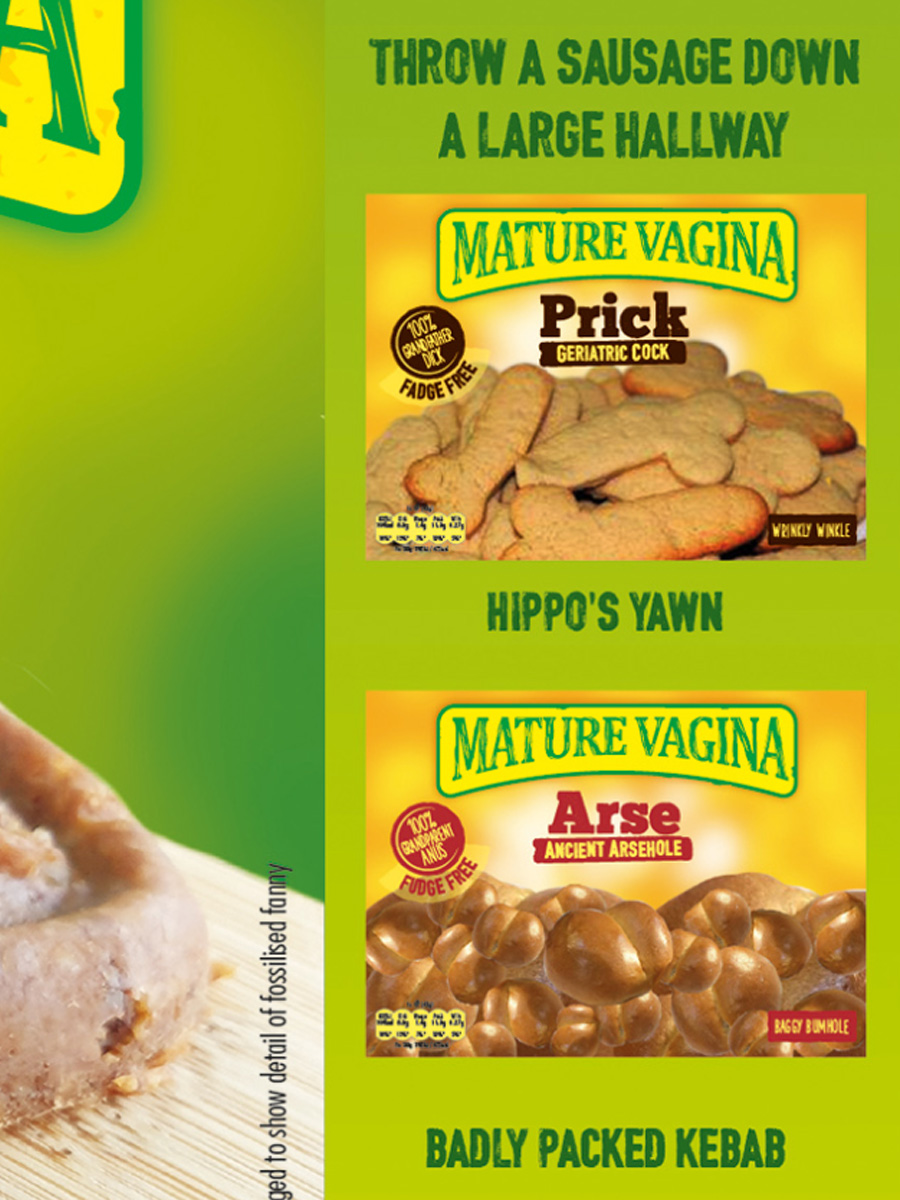
I scan an original for size and placement reference, but I do not use any part of that scan in the finished piece. Logos, barcodes, ingredient lists, product photographs, certification marks, legal lines and stray decorative symbols are recreated from scratch.
Keeping a real packaging element would feel like it corrupted the corruption. The point is not simply to vandalise an existing design. It is to rebuild the whole thing as though the rude version had always existed.
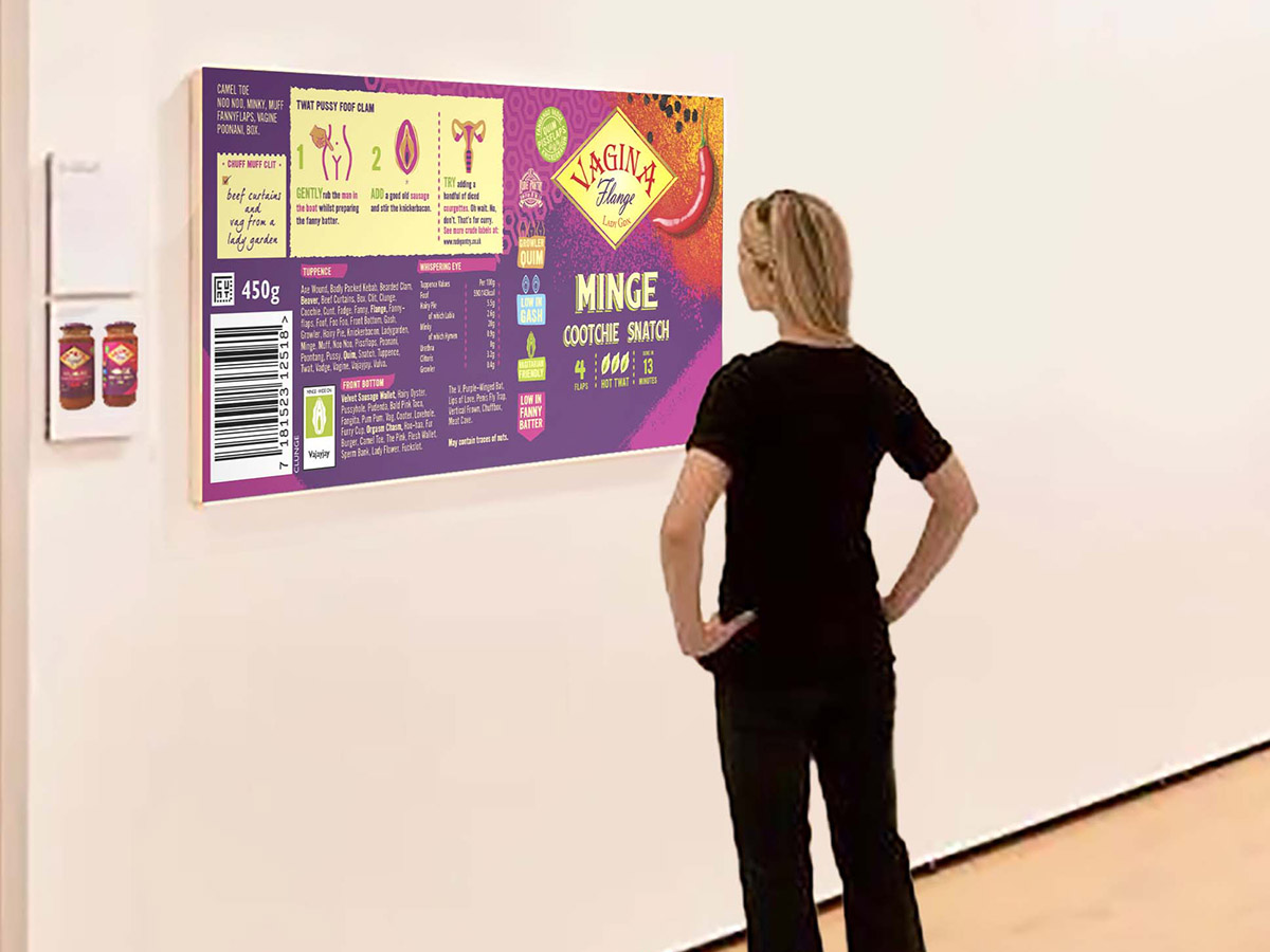
That means the joke on the front is only the beginning. If the original has nutritional information, preparation instructions, tiny range images, recycling symbols, manufacturer details or a barcode, I usually rebuild those too. Sometimes a barely visible side-panel detail takes longer than the main logo.
None of the pieces are quick. They usually take several days, and difficult ones can swallow many full days.
“You’ve got too much time on your hands.”
Entirely acceptable feedback
THE DETAIL
Why the Detail Matters
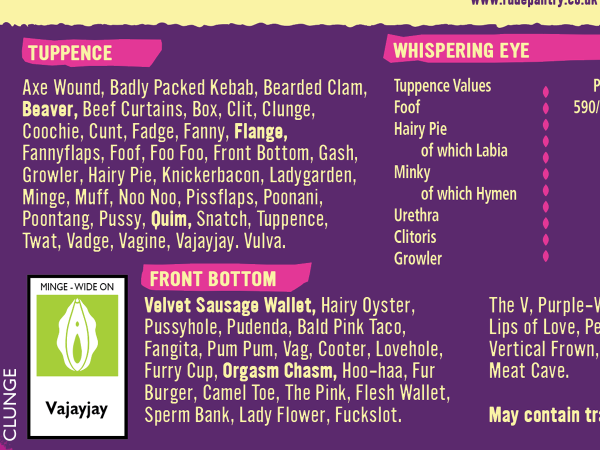
The rude name matters, but the joke is not finished when the name works. What interests me is the excessive commitment to carrying the idea through every last part of the packaging. The barcode may scan as rude words. Tiny symbols may be redrawn. Ingredients, warnings, slogans and range information can all become part of the same joke.
Most of those details will never be noticed. That does not make them optional.
When I show the work quickly on my phone, usually in a pub, I often have to explain that the backs and sides have been changed too. When people get time to study a piece properly, they sometimes notice the scale of it for themselves. That is one of the reactions I am aiming for.
I treat the pieces as artworks. The graphic design needs to be convincing even when the subject matter is childish, crass or completely absurd. That contrast is a large part of what makes the project funny to me.
THE NAMES
Finding the Right Name
Most Rude Pantry pieces begin with products already in my cupboards. I start with the structure of the manufacturer name, product name and variety, then look for substitutions with some visual, rhythmic, alliterative or rhyming connection to what was there before.
The match does not have to be exact, especially if I am carrying one theme across the whole package, but it should retain some cue from the original. A random rude phrase is weaker if it has no visual or linguistic relationship to the thing being reworked.
Not every new word has to be obscene. Hairy Conkers and Chocolate Starfish work because of the phrase rather than because every individual word is rude.
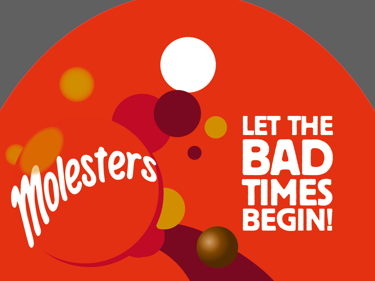
Once a name is locked in, I usually commit. One exception was a spoof of Maltesers called Molesters. It felt more uneasy than funny and too closely associated with sexual assault, so I abandoned it.
“[ADD A REAL REACTION HERE]”
Someone who noticed far too much
VINTAGE
Vintage Is Harder Than It Looks
Most of the work so far has been based on contemporary packaging that I physically own. That gives me every panel, seam, instruction and tiny line of text to study.
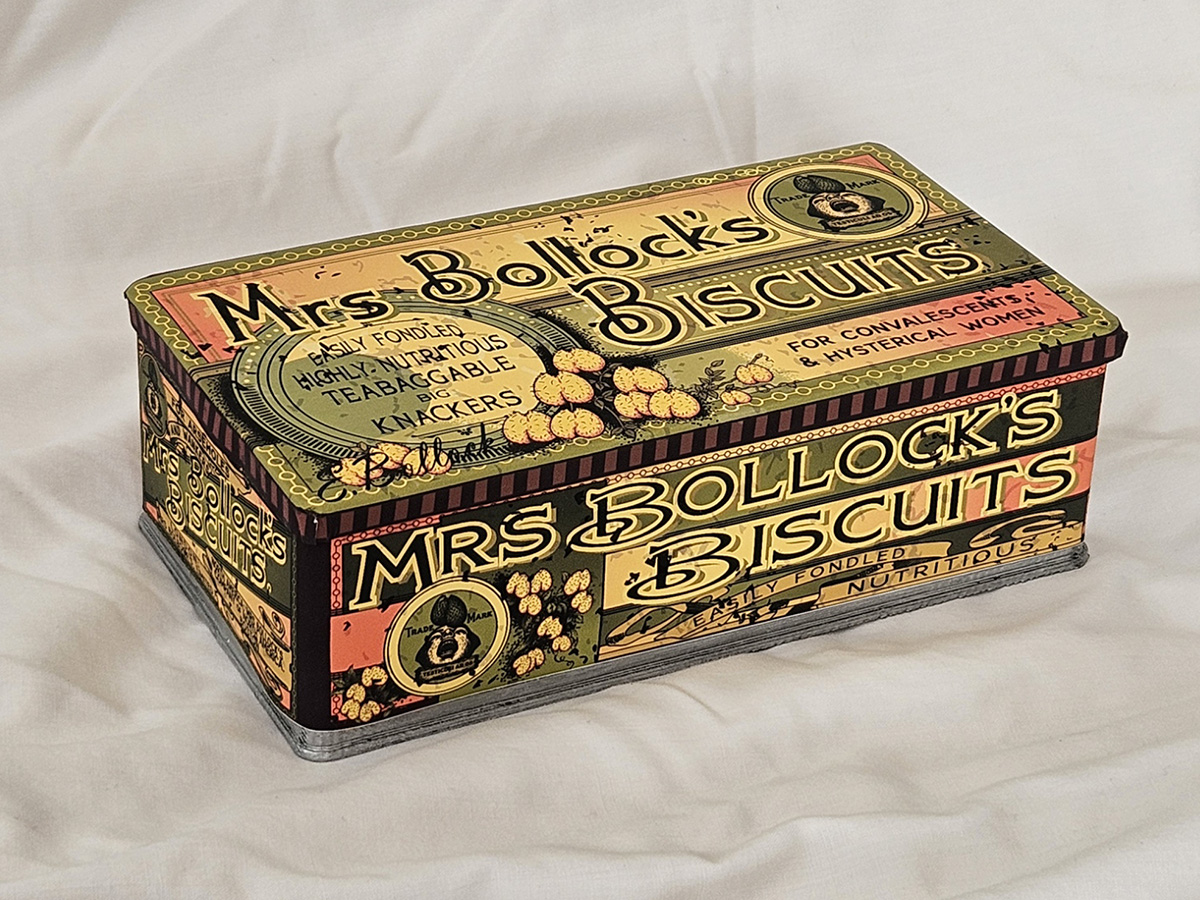
Vintage pieces create a different problem. Front views are often easy to find, but backs and sides may not exist online at all. An antique biscuit tin is manageable because sellers tend to photograph it from every angle. A 1960s jam jar may survive in one front-facing photograph and nothing else.
Rear labels matter just as much to my sense of authenticity and completeness, so sometimes I have to compromise. If no usable reference exists, I would rather omit a detail than invent something obviously anachronistic.
There are exceptions. Some Rude Pantry seals include a grawlix that would be historically wrong on an early label, but the seal is my own invention, so that bothers me less.
AI
Where AI Actually Helps
I use AI more now, particularly for photographic elements and difficult display lettering, but it has not made the designs noticeably quick or easy.
AI is prudish, fickle and restrictive. Sometimes it refuses rude imagery, sometimes perfectly ordinary words, and it rarely produces exactly what I need first time. A useful image may take many rounds of direction or begin as a crude Photoshop composite that is then refined.
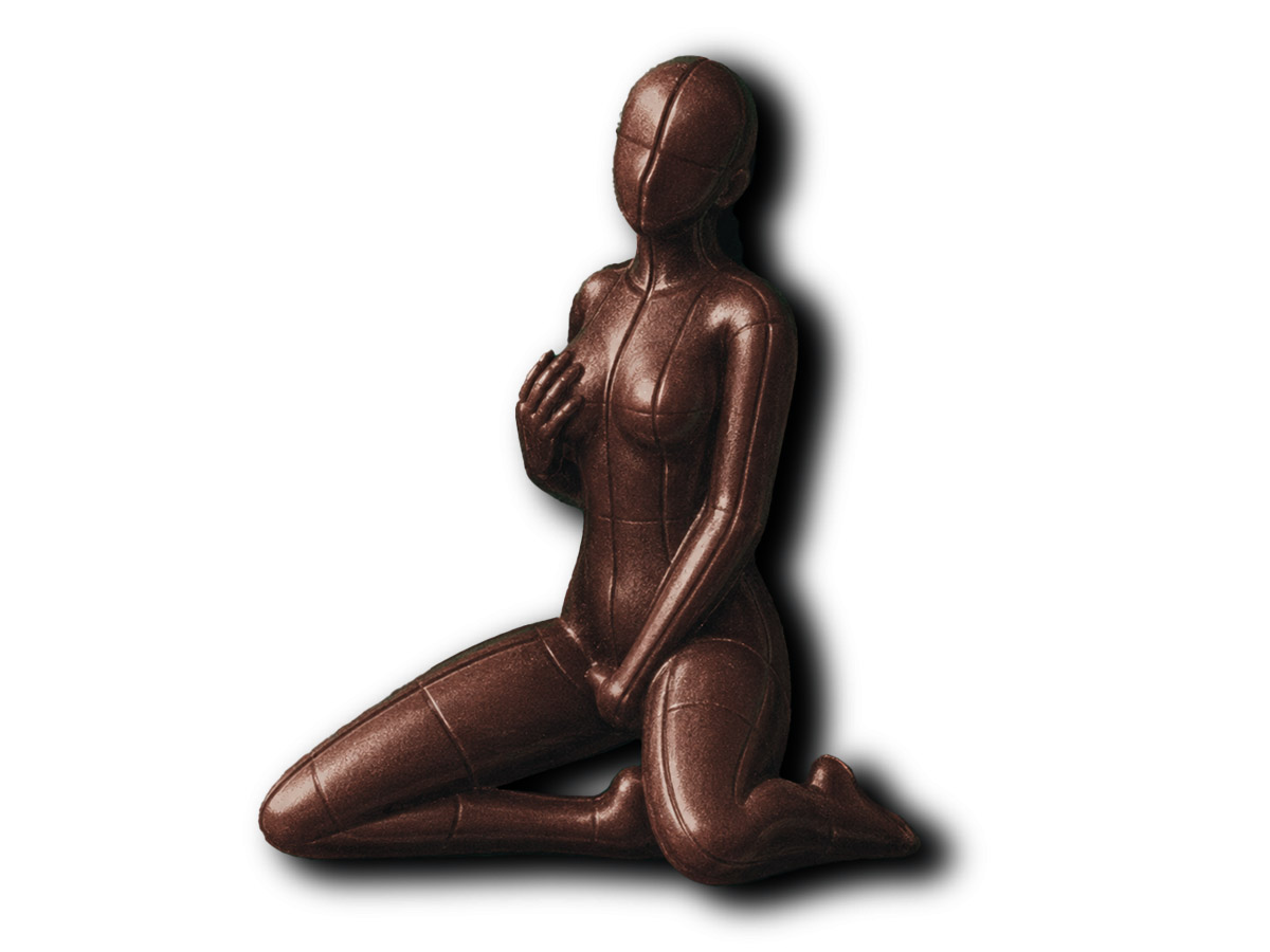
For a minor label image, generating a chocolate woman can be more practical than physically making one or badly assembling one from unrelated photographs. Likewise, vintage display lettering can sometimes be approximated well enough to provide a usable component.
That does not remove the design work. I still have to form the idea, decide what changes, guide the image, composite it into the larger artwork and make it belong there.
HOUSE BRAND
How Rude Pantry Became a Brand
Rude Pantry began as the name of the overall project rather than the brand printed on every product. Most pieces are still direct reworkings of existing manufacturers and products.
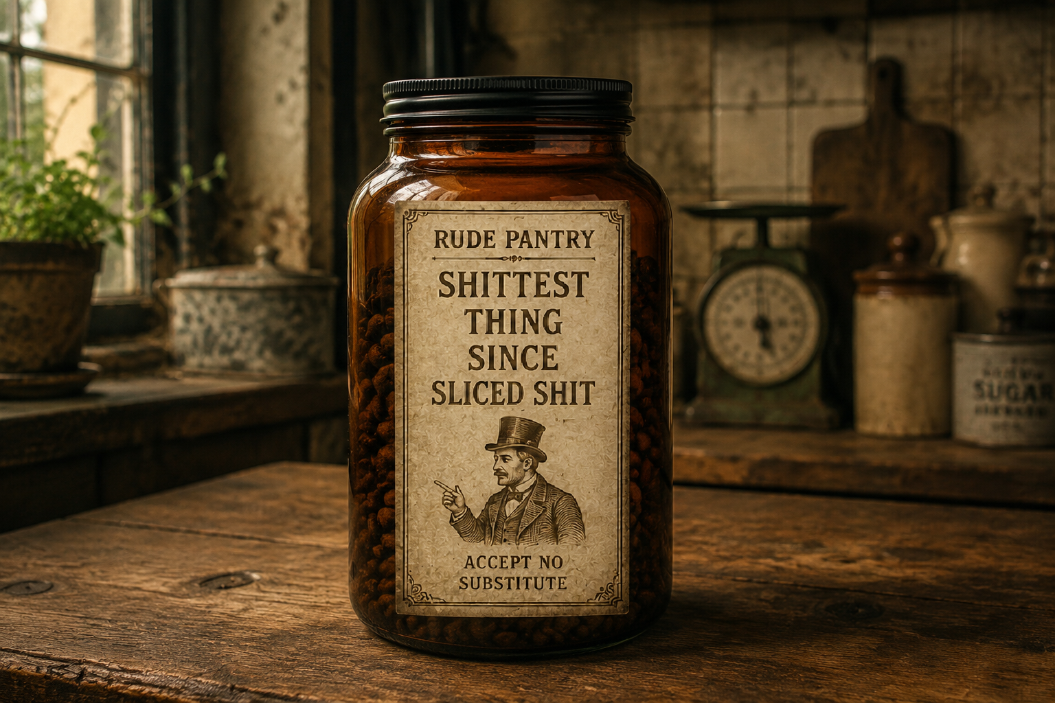
Repeated image experiments also produced fully Rude Pantry-branded labels. At first that happened mainly because AI did not know any better. I decided to make it part of the project properly.
So some imagined early products or house ranges can now carry the Rude Pantry name and monogram directly. Others will continue to spoof the complete manufacturer, product and variety structure of their originals. Both belong to the same collection.
“[ADD ANOTHER REAL REACTION HERE]”
Preferably somebody slightly baffled
SELLING THEM
Why You Can’t Buy It
The frustrating part is that the pieces people respond to most strongly are also the ones I am least able to sell. They are based on recognisable commercial products, which brings obvious trademark, copyright, labelling and consumer-protection problems.
I would like to think some of the designers or staff behind the original packaging might enjoy the work as an unusually detailed and affectionate corruption of what they made. Their intellectual-property lawyers might take a less enthusiastic view.
In practice, most pieces are seen by a small number of friends, Facebook followers and people I happen to show in pubs. The website gives the project room to exist as a body of work rather than a series of isolated rude labels, and lets the fiction spread into company history, founder biographies, institutions and product lore.
I do not know how large an audience it will find. I will still consider it worthwhile if I think it is funny, the work looks right, and the whole thing exists in the form I wanted. If a stranger eventually contacts me because they have spent far too long examining the back of a fictional biscuit packet, that would be lovely too.