VISUAL IDENTITY
Brand History
One hundred and fifty years of logos, seals, rebrands, reversals and occasional corporate humiliation.
Logos, Wordmarks, Monograms. Mammograms.
Rude Pantry has never relied on a single mark. Different jobs called for different levels of dignity, detail and legibility.
Wordmark
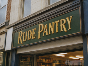
The company name in a recognisable style. Used on shopfronts, print adverts, delivery vehicles and staff uniform gussets. It never entirely disappeared and still survives in places such as the website header.
Seal
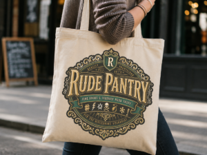
The grand decorative company emblem. It appeared on formal packaging, adverts, certificates, company paperwork and porcelain staff toilets.
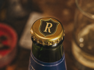
Monogram
The combined R and P on a shield, used wherever the full company name or seal was impractical. In 1950 a mammogram was accidentally used on a bottle cap. Further confusion saw several women’s breasts being monogrammed.
1876–1885
The Beginning

The original trading wordmark appeared wherever the company name needed to be seen quickly, from shopfronts to delivery carts. It survived several later redesigns because it remained practical, legible and familiar to customers.
Although lettering spurs were all the rage in Victorian times, the Rude Pantry wordmark gained its own due to a mishearing of “the company being very fond of slurs”.
1885–1938
Victorian Excess
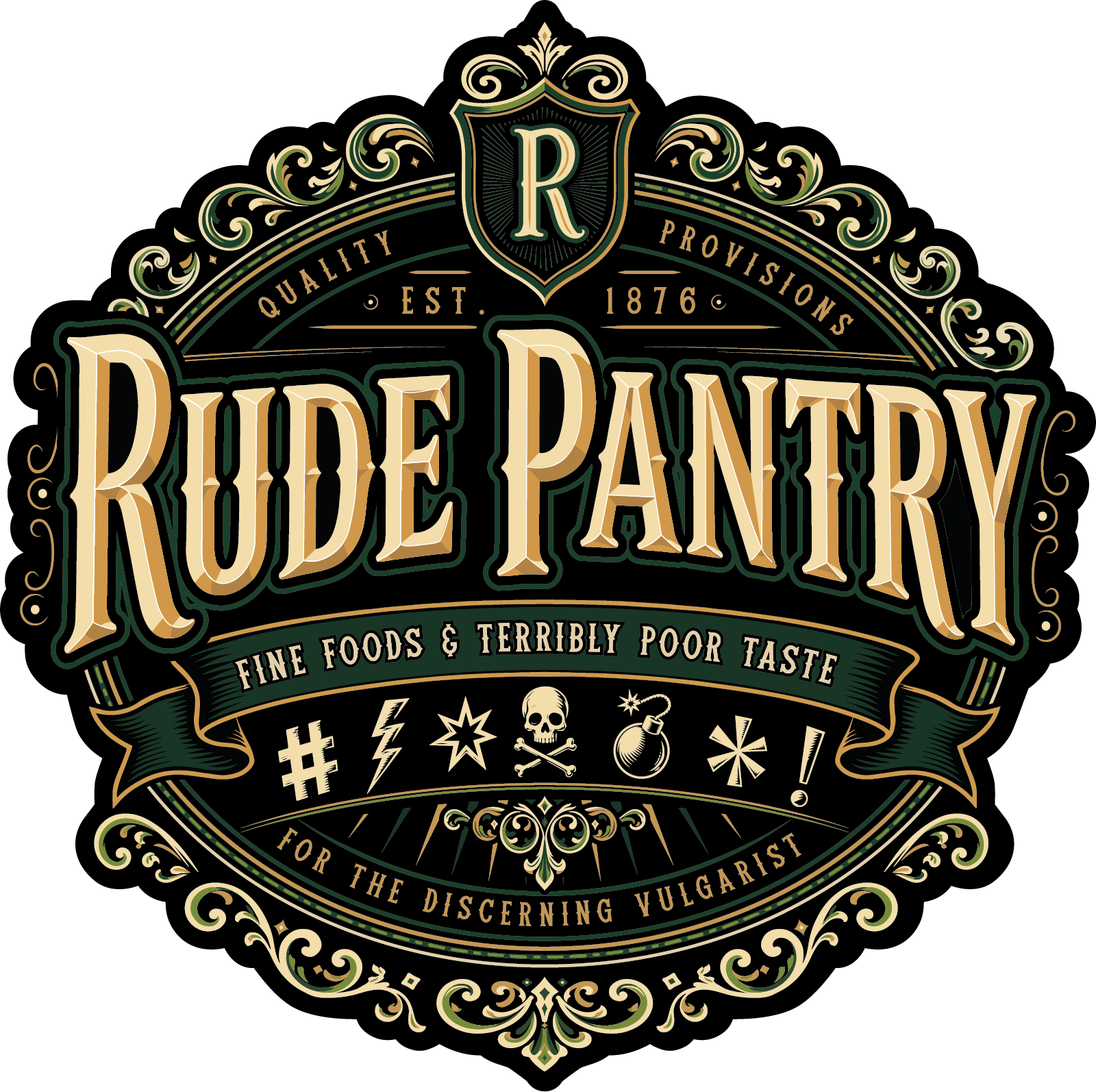
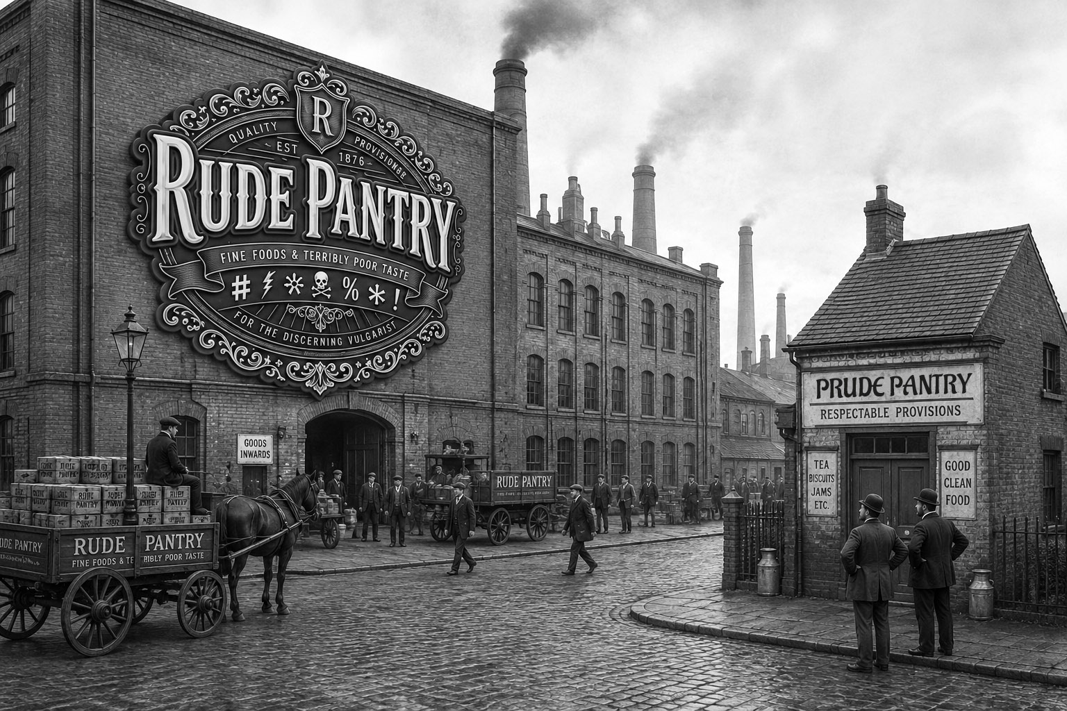
Business was booming, so the corporate seal was upgraded with enough scrollwork to choke a horse. Founder Percival Wankswell believed a logo should contain at least as many decorative flourishes as the average dockworker knew swear words.
The simpler wordmark continued on shopfronts and adverts because the full seal was expensive, illegible and, on smaller buildings, structurally inadvisable. Early attempts to attach it directly to factory walls led to several nervous breakdowns among signwriters, although most recovered after generous quantities of Bournville Boulevard dark chocolate.
1938–1957
Austerity Arrives Early
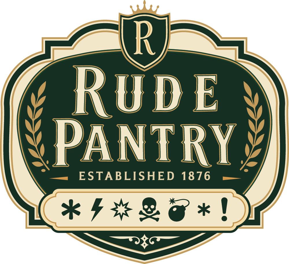
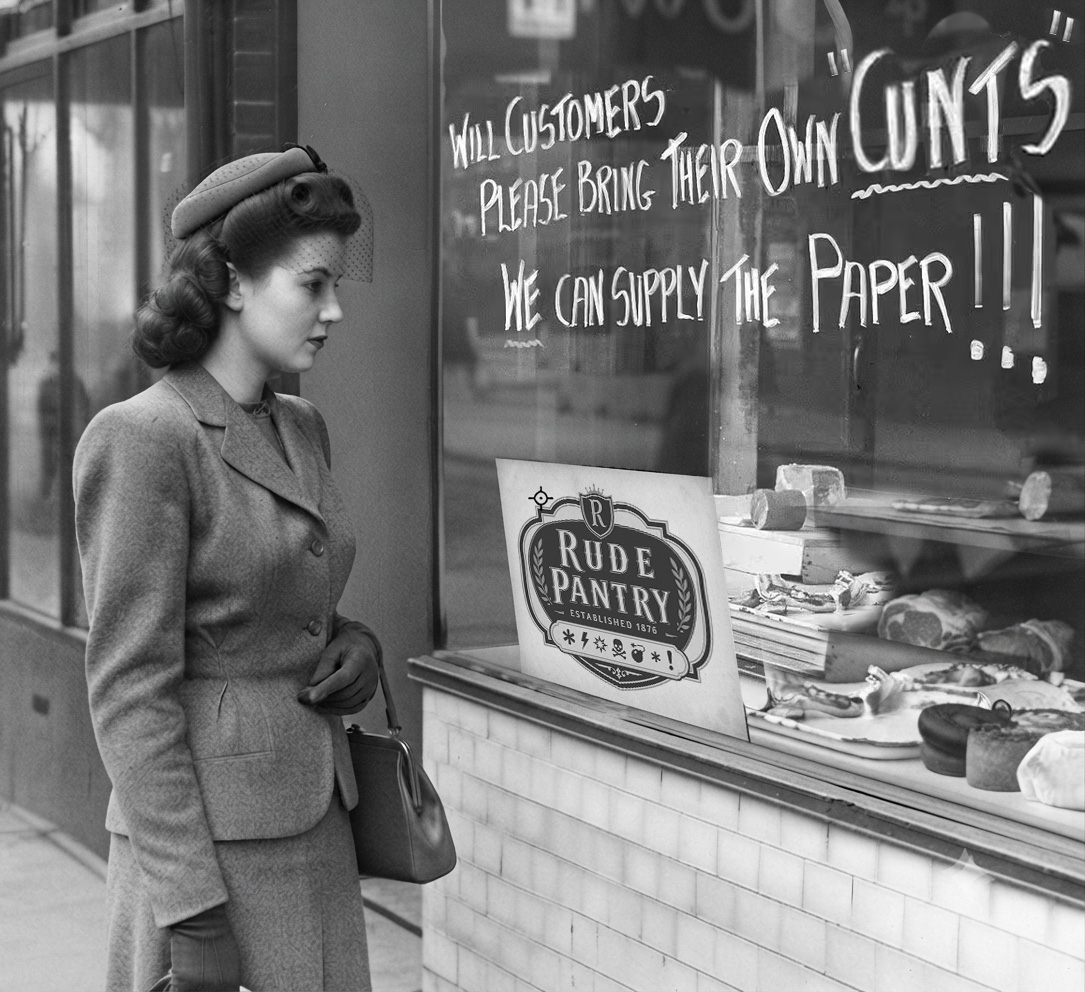
In 1938 the company modernised its seal just enough to appear progressive without alarming customers who still believed having inside toilets was showing off. The old logo and wordmark carried on wherever they still did the job, but for most labelling purposes the 1938 version took over.
The company was later commended by the Ministry of Supply for rationing its own logo. Flourishes left over from the old identity were recycled into labels such as Old Farty’s Banana Shit Bits.
1957–1970
The Supermarket Age
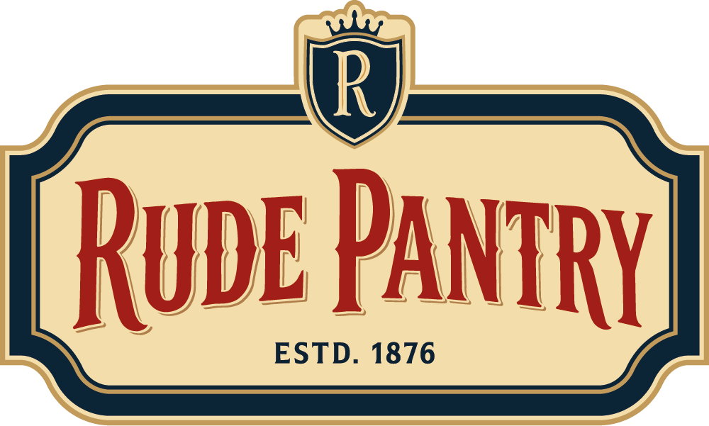
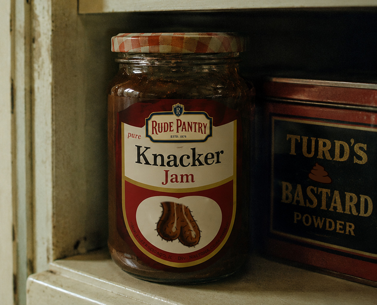
Packaging became simpler, cleaner, brighter and easier to spot on shop shelves. Red and blue were added. The type reverted to more conservative Victorian spacing and the sweary grawlix symbols were rested for the first time since 1885.
They were put into cold storage alongside several unused mega-fucks from the 1946 harvest, more than 400 gallons of concentrated arse and three tons of compressed words for knob.
1970–1971
A National Embarrassment
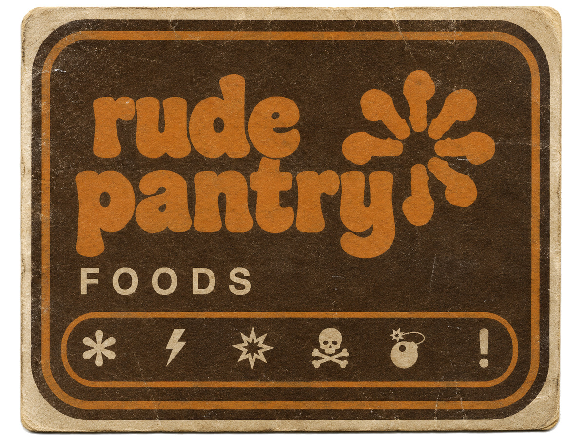
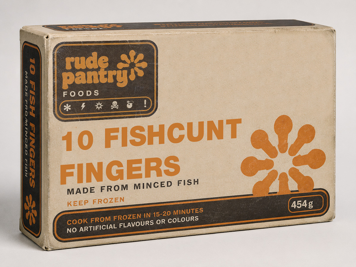
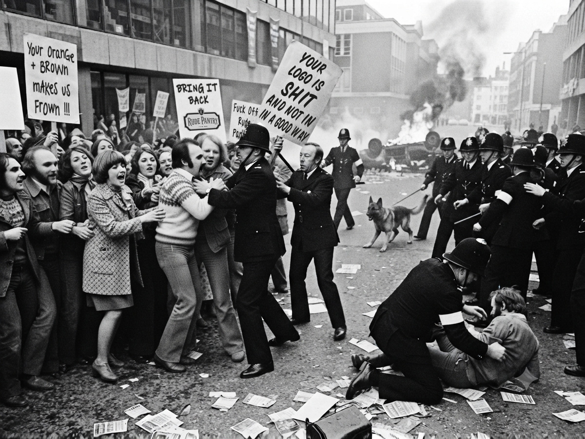
In 1970 the company embraced modern graphic design and fashionable palettes with almost religious enthusiasm. Ornament disappeared, the colour became mostly brown and orange and every unnecessary flourish was removed except for the return of symbolic swearing.
Unfortunately the resulting identity resembled an own-brand gonad cleaner from a supermarket nobody respected. The reaction was immediate. Rude Pantry’s place in British culture, combined with such an apparently unwelcome change, led to several incidents of social unrest that became known as the “Rude Riots”.
The identity lasted for approximately one humiliating year.
“Please put the old one back.”
BROADLY REPRESENTATIVE PUBLIC OPINION, 1970
1971–1992
The Apologetic Rebrand
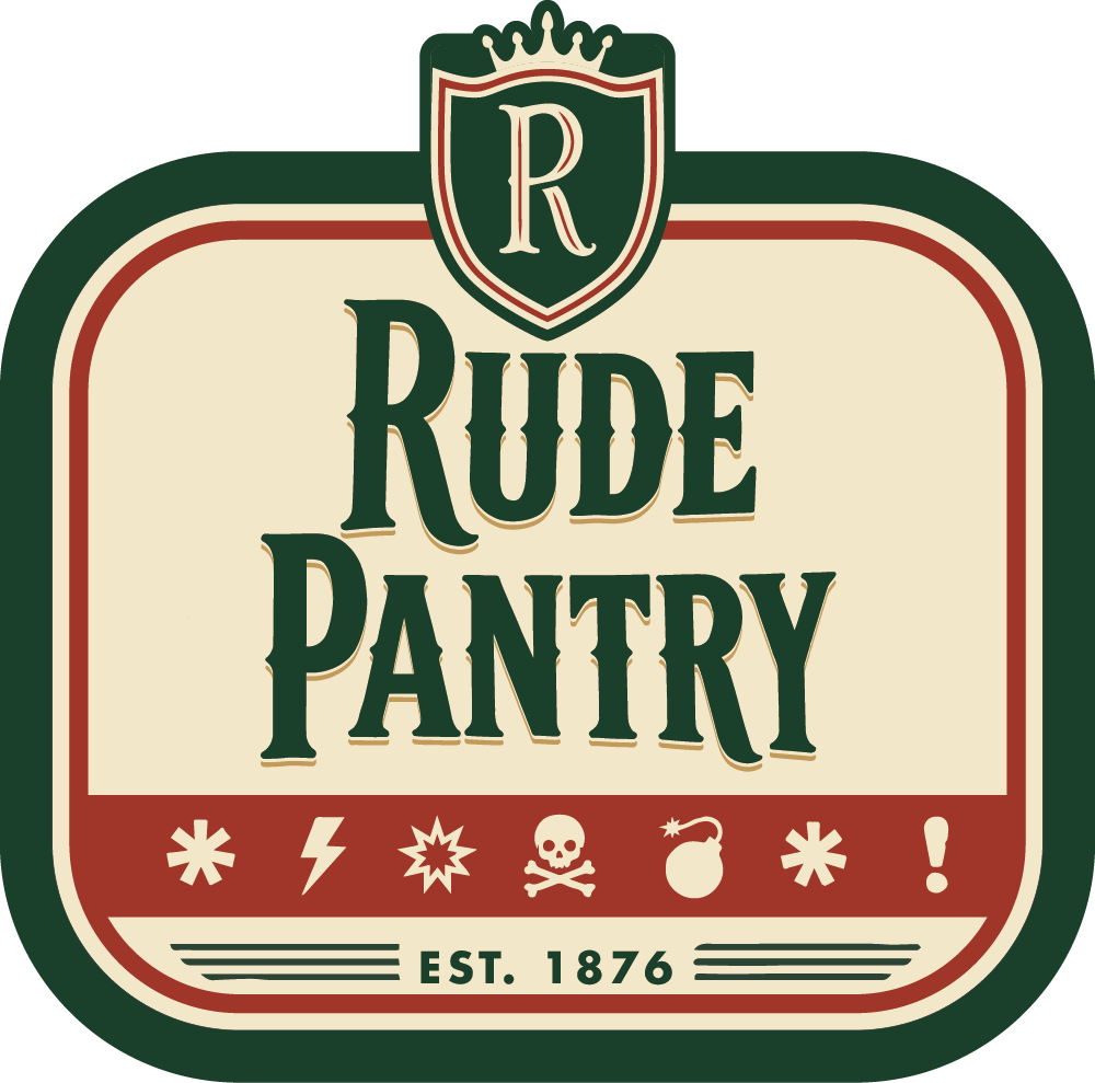
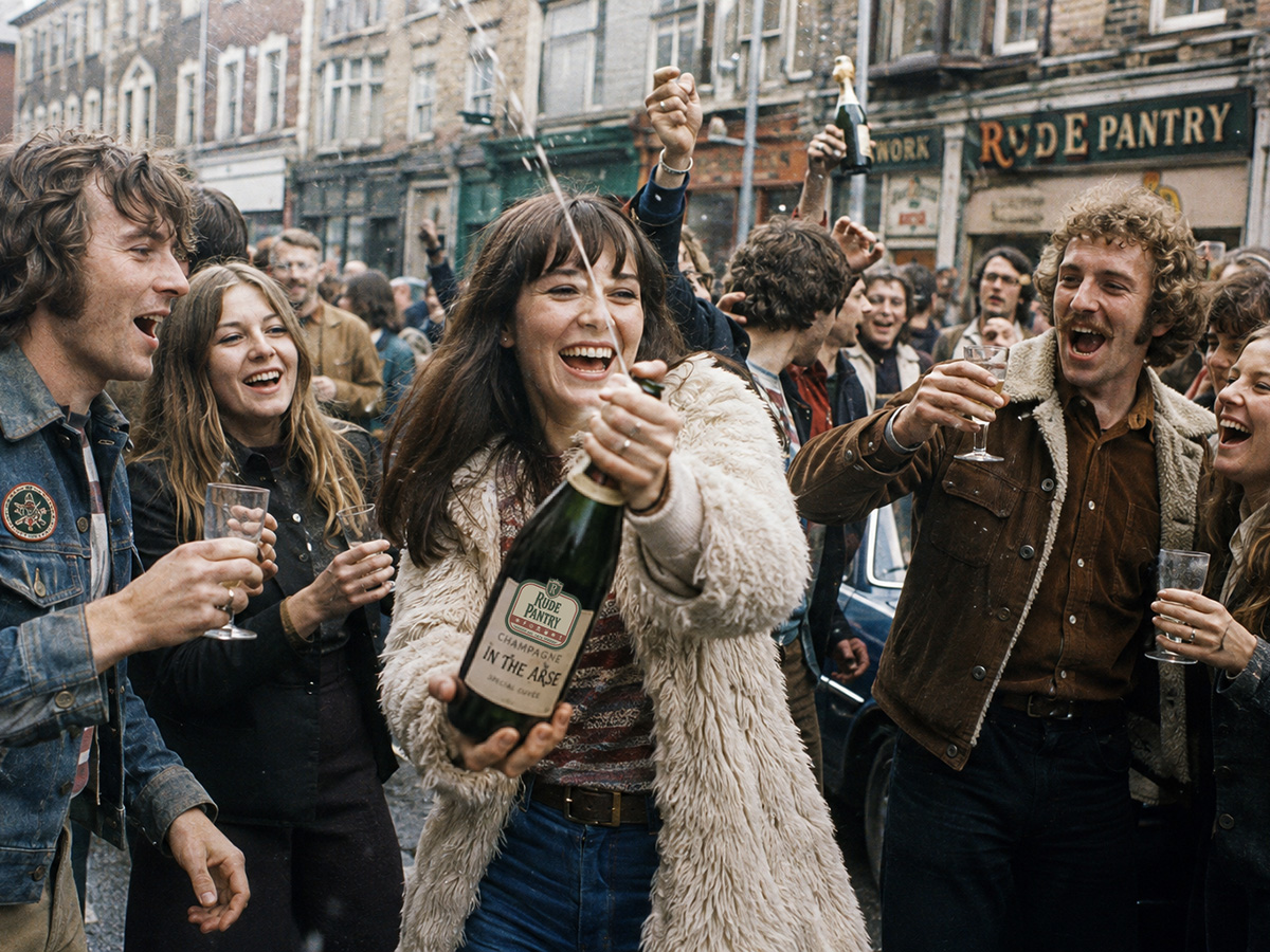
Following widespread ridicule and widespread violence, the company rediscovered tradition. Green returned, serif lettering reappeared and Britain slowly resumed normal breathing.
Production of the brown packaging ceased immediately. Retailers were instructed to remove it from public view, while customers could exchange unopened products for identical products in more reassuring traditional packaging. More than 600,000 packs were returned during the first fortnight.
Although this was still a change rather than a reversal, customers also rejoiced upon the reintroduction of the “grawlix” swear symbols that had been absent for over a decade
1992–2008
Vector Modernism
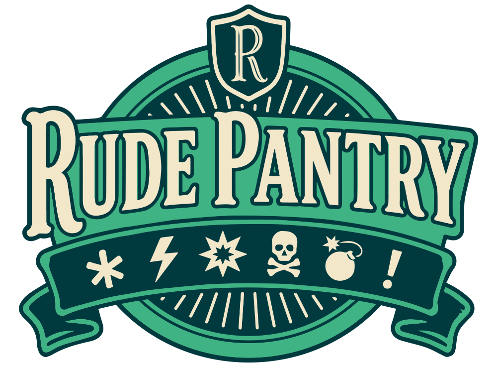
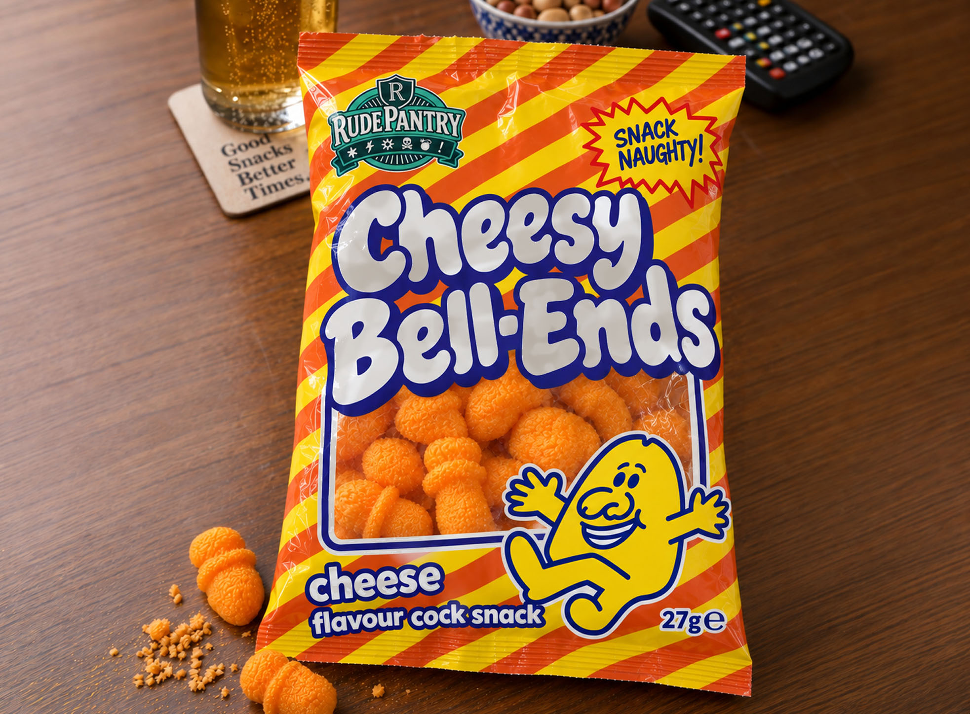
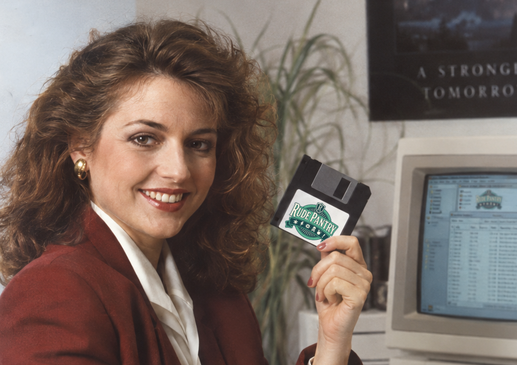
(Corporate training material, 1993.)
Freshly armed with shiny vector software, Rude Pantry logo and packaging design entered the digital age in the 90s with cleaner, fully scalable designs. Now the artwork could be as sharp as the language it included.
The public had been wary of another proposed change to a beloved brand, but this iteration occurred with no protests.
Digital design was new to the company, however, and the first scalable obscenity was accidentally enlarged to several hundred feet. The resulting Norky Nibbles box had to be removed from a Staffordshire printing works using specialised cranes.
2008–PRESENT
Back to Our Roots. Again.
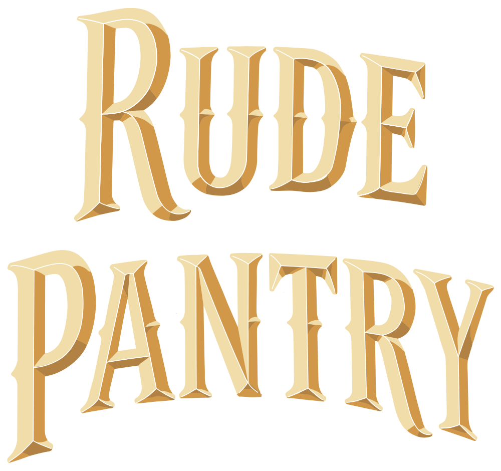
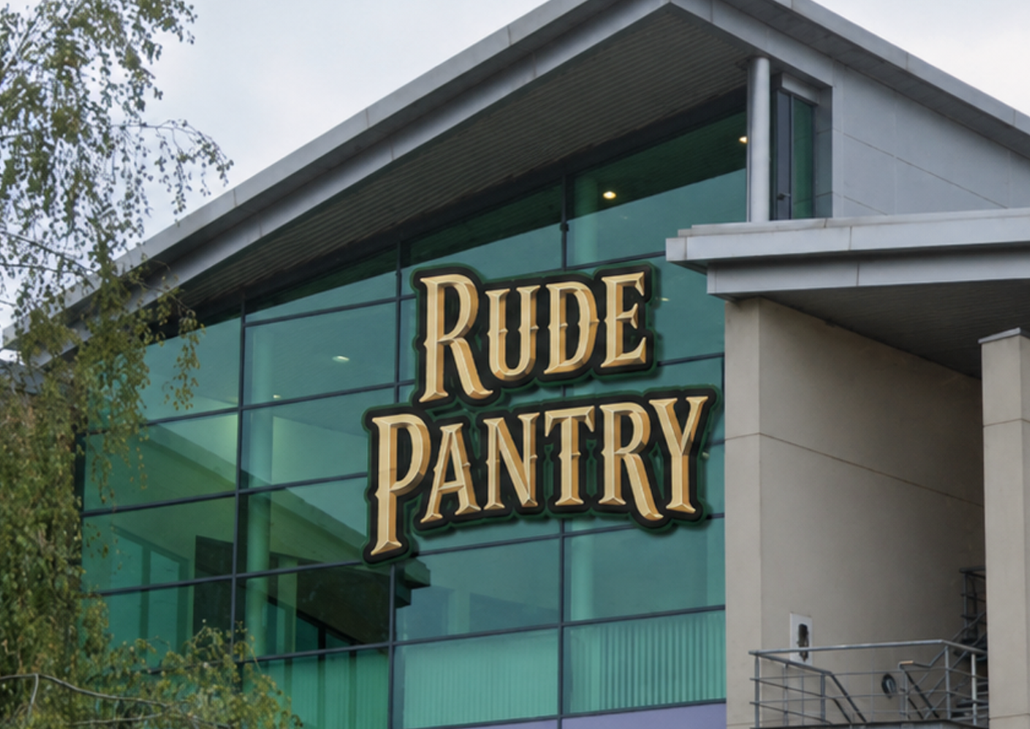
The noughties saw a return to Rude Pantry’s earliest identity, removing the container shapes that had surrounded the wordmark for over a century and allowing the name to stand alone once again.
The consequences were unforeseen. Over 120 years of pressurised vulgarity, safely contained within successive logos, was released at once. The resulting discharge led to the sad loss of the company’s lead graphic designer.
Findings FROM THE ARCHIVE
Conclusions
Mostly that major alterations to the company identity should be extensively researched, carefully tested and, wherever possible, not result in mounted police.
LONGEST SERVING
1885
Fifty-three years of scrollwork, flourishes and design stability.
SHORTEST SERVING
1970
Retired after less than one year, several thousand complaints and £1.2 MILLION
spent on unwanted brown and orange.
MOST EXPENSIVE NOTHING
1987
£840,000
Spent in 1987 investigating whether the existing logo should remain exactly as it was. It did.
The company remains committed to preserving its distinguished visual heritage until management or society feels its passe and needs updating again.