
PRODUCT
Health Biscuits
PRODUCT DESCRIPTION
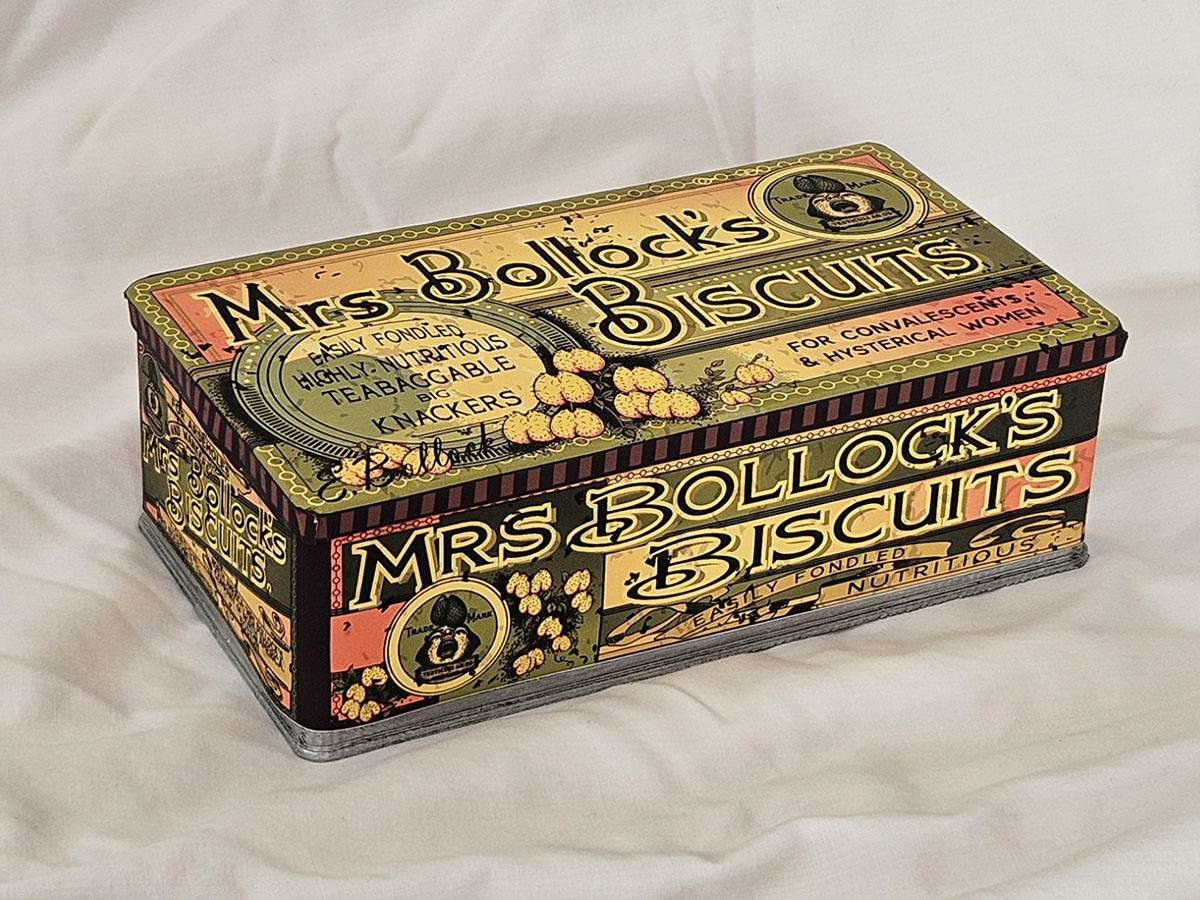
Mrs Bollock’s Biscuits
Easily fondled. Highly nutritious. Teabagable big knackers.
Health biscuits made with malted grain extracts, presented as a nourishing, easily digested food for children, convalescents and those with delicate digestion.
PUBLIC RESPONSE
Customer Reviews
★★★★★
Marvellously invigorating comestibles. Gave me an appetite like a judge at a three-course brothel.
Ms. Elouise Tits, Skipton
★★★★☆
Most efficacious. After three with breakfast I produced a leviathan of a stool, thick as a church candle and seemingly without end. I have not known such relief since the Jubilee. God bless these biscuits.
Rev. Charles Goolies, London
★☆☆☆☆
I do appreciate a handsome box. Mine required a firm grip and considerable effort before it finally opened to great relief.
Florence Bollocque, Winchester
PRODUCT INFORMATION
Nutritional Information
Nutritional values were not recorded on the source page.

BEHIND THE LABEL
INSIDE THE DESIGN
REAL WORLD DETAILS
Origins
Antique tin box design for health biscuits.
There was no physical original but I found some good quality images on eBay for reference.
Full Design
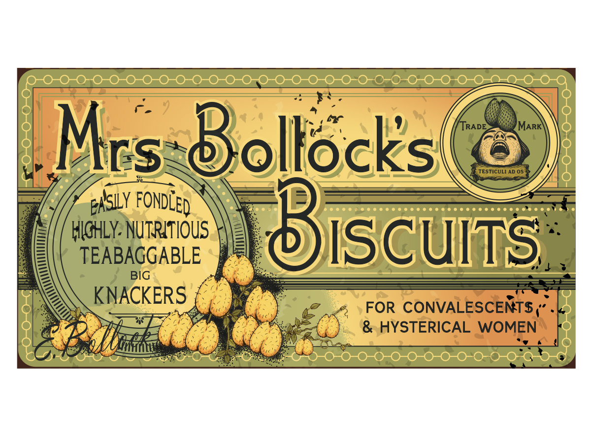
Original vs Rude Pantry Version
| Original Product | Rude Pantry Product | |
|---|---|---|
| Parent Company | Mellin’s | Rude Pantry |
| Brand | Mellin’s | Mrs Bollock’s |
| Product Name | Biscuits | Biscuits |
| Variety | n/a | n/a |
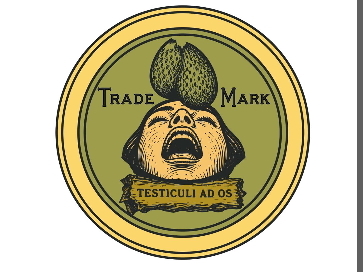
| Dominant Theme | Flowers and Graphical elements | Testicles |
| Barcode Numbers Spell | n/a | n/a |
| Barcode Scans As | n/a | n/a |
Comparison
Development & Detail

Notes
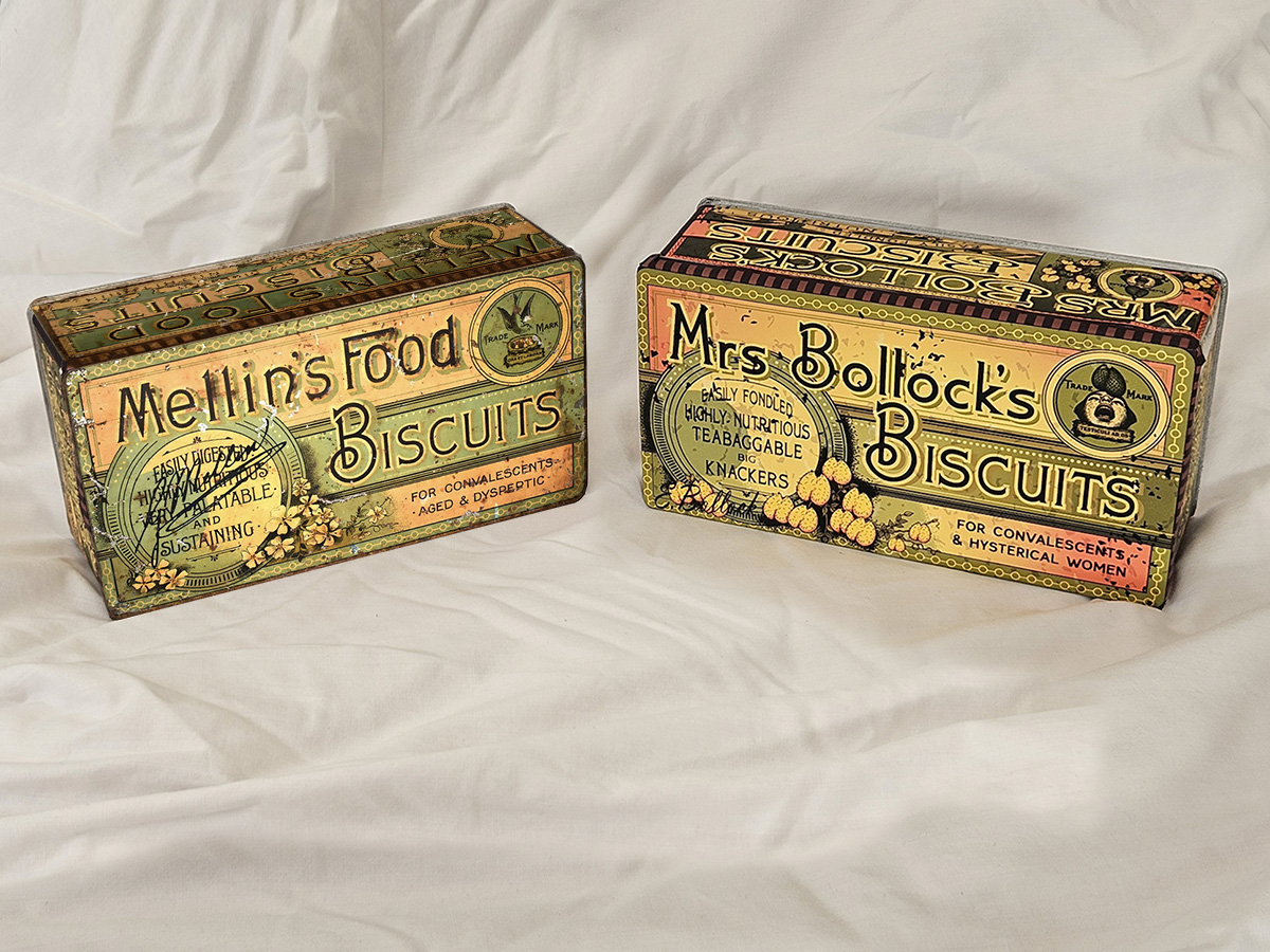
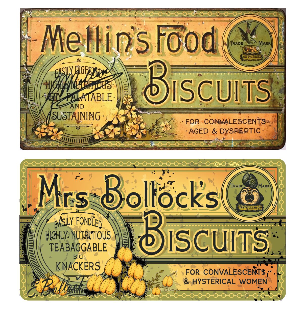
This was my first foray into vintage/antique packaging and labelling. Apparently, the Mellin’s Tin is probably from some time between 1900 and 1910, so I’m arbitrarily pegging it at around 1905.
The products name has had a bit of a deviation from the usual style and I just changed the name to something that neither looked nor sounded similar to the original. But it was still supposedly a founder’s name.
This one was more complex than I expected. And I added a bunch of SVG (vector-based) dust and debris to the surface of the designs. I could have more effectively done that in photoshop, but apart from the flowery/knackers bits, it’s all vector based.
This is also the first packaging I’ve done where I had no original physical product. Plus there was nothing to put the new design next to in a supermarket of course.
Although genuinely mild and sustaining, their “health” claims were more modest than the advertising often suggested. Not that it even mentions much about the supposed health aspects on the original packaging.