PRODUCT
Gummy Sweets Mix
PRODUCT DESCRIPTION
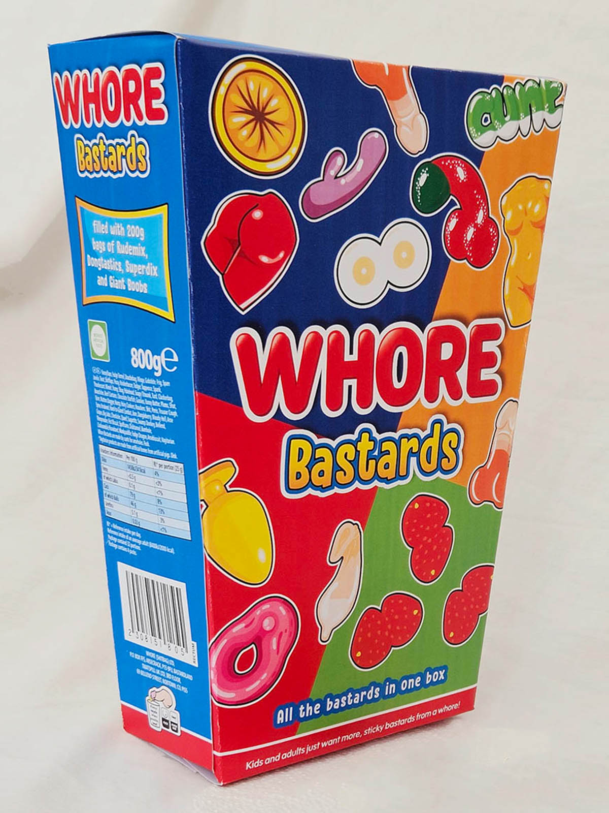
Whore Bastards
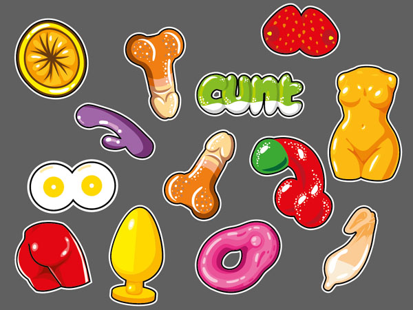
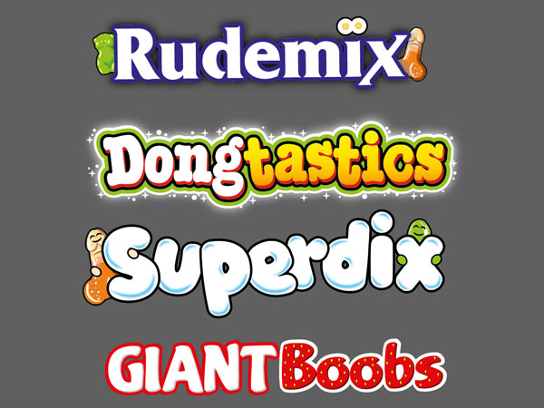
A generous family-sized helping of dicks, boobs, bums, condoms, vulvas, buttplugs, vibrators, female torsos and anuses.
An assortment of mixed gummy sweets in assorted novelty shapes.
PUBLIC RESPONSE
Customer Reviews
★★★★☆
Nice and fruity. I had a nice pair stuck together, but gave them a good tug and ended up with a sticky mess all over my fingers.
Rachel Douchebag, Winchester
★★★★★
I always let my wife choose first. She likes to rummage around until she finds one that feels right. before putting a fruity foamy one in her mouth.
Gavin Fucktard, Bishop Auckland
★★★★☆
Excellent for sharing. I offered my husband one and he spent the evening with his hand in and out my big box.
Aisha Sod, Harrogate
PRODUCT INFORMATION
Nutritional Information
Nutritional values were not recorded on the source page.

BEHIND THE LABEL
INSIDE THE DESIGN
REAL WORLD DETAILS
Origins
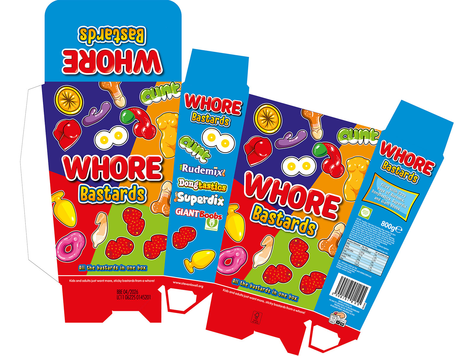
Box packaging for multiple various packets of gummy sweets.
Another one where I thought it would be fairly quick and easy, but there is more to create than I initially thought.
Full Designs
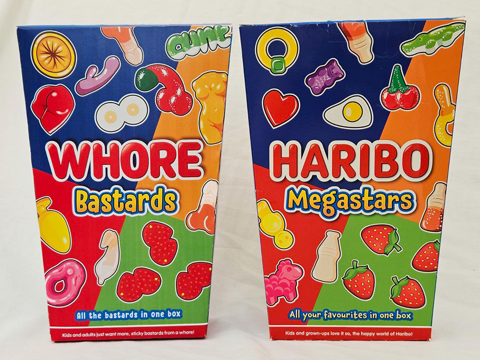
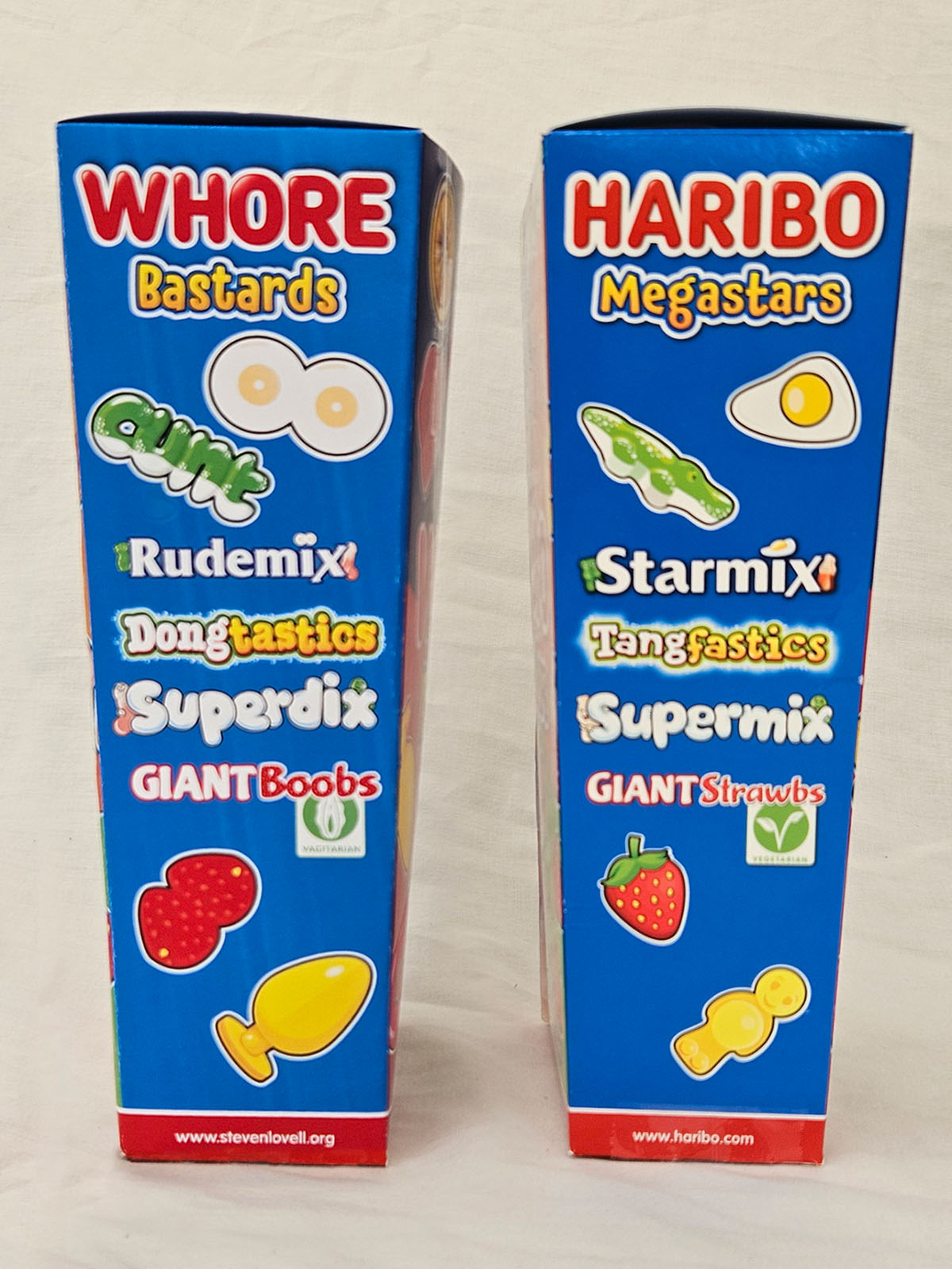
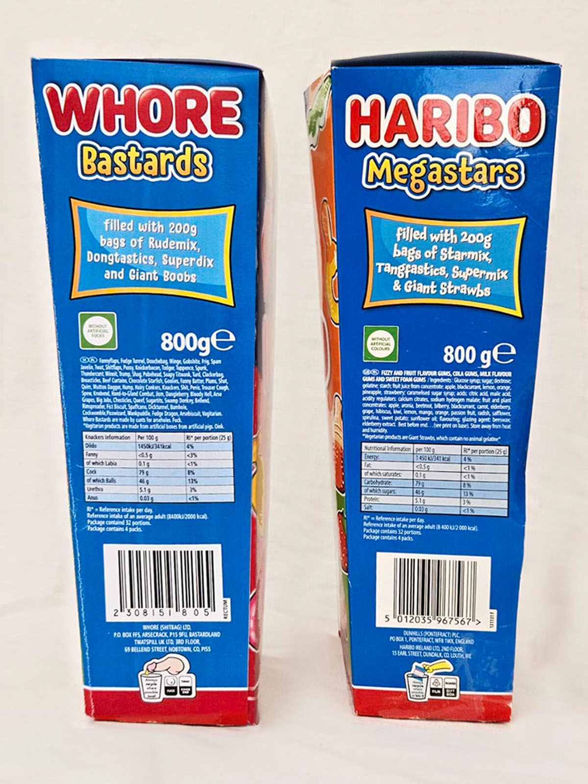
Original vs Rude Pantry Version
| Original Product | Rude Pantry Product | |
|---|---|---|
| Parent Company | Haribo | Rude Pantry |
| Brand | Haribo | Whore |
| Product Name | Megastars | Bastards |
| Variety | n/a | Bastards |
| Dominant Theme | Gummy Sweets on a colourful background | Sweets in Rude shapes and general crudeness |
| Barcode Numbers Spell | 5012035967567 | 23 8 15 18 5 = WHORE |
| Barcode Scans As | Haribo Megastars n/a with Croutons 4 Sweetss | WHORE! |
Comparison
Development & Detail