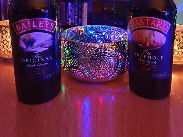
PRODUCT
Cream Liqueur
PRODUCT DESCRIPTION
Irish Cream Liqueur
Cream liqueur, blending smooth Irish whiskey, rich spirits, and fresh Irish dairy cream with hints of cocoa and vanilla
PUBLIC RESPONSE
Customer Reviews
★★★★★
I wanted something stiff and creamy. Groped around, found something hard and black, finished it off and ended up with a dribbly wrist.
Carol Ballsack, Slagby Norfolk
★★★★★
Very creamy. I gave my wife a small one at Christmas. She said she wished I’d give her a bigger one all year round. I got a bit carried away and ended up leaving a sticky mess all over the coffee table.
Brian Wazzock, Arseford, Lancashire
★★★★☆
Lovely and creamy. Three glasses later I was top-bollock naked in a hot tub with the neighbours, their plumber and Big Sue, who kept slapping my arse with a pool noodle. Woke up in a wardrobe with a traffic cone up my arse and somebody’s false teeth. Would buy again.
Rebecca Fannyflaps, Penistone
PRODUCT INFORMATION
Nutritional Information
| Typical values | Per 100g | 2 × portion (42g) |
|---|---|---|
| Energy | 1981 kJ / 473 kcal | 832 kJ / 199 kcal |
| Fat | 19.8g | 8.3g |
| of which saturates | 3.4g | 1.4g |

BEHIND THE LABEL
INSIDE THE DESIGN
REAL WORLD DETAILS
Origins
Cream Liqueur Bottle.
The original bottle already had a premium appearance with metallic details, making it a strong base for a Rude Pantry rebuild.
Full Design
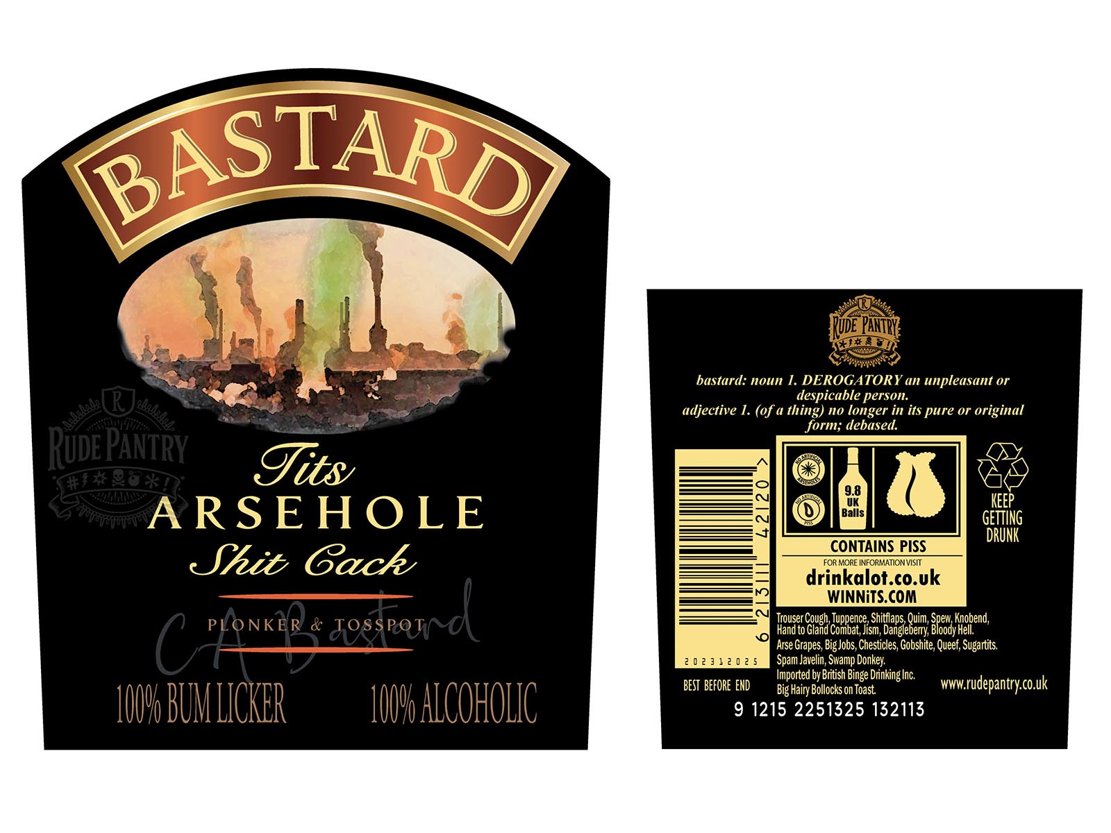
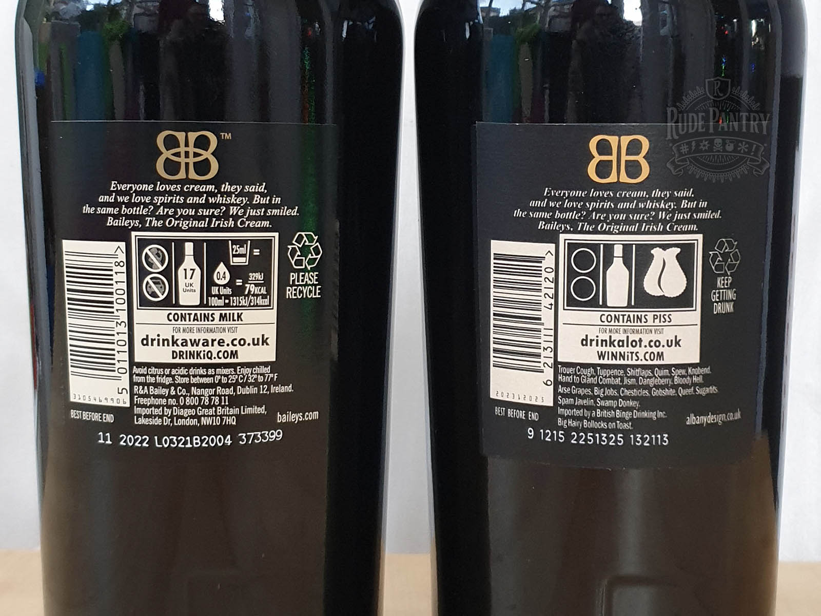
Original vs Rude Pantry Version
| Original Product | Rude Pantry Product | |
|---|---|---|
| Parent Company | R & A Bailey & Co. | Rude Pantry |
| Brand | Baileys | Bastard |
| Product Name | Baileys | Bastard |
| Variety | Original | Arsehole |
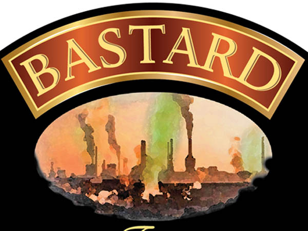
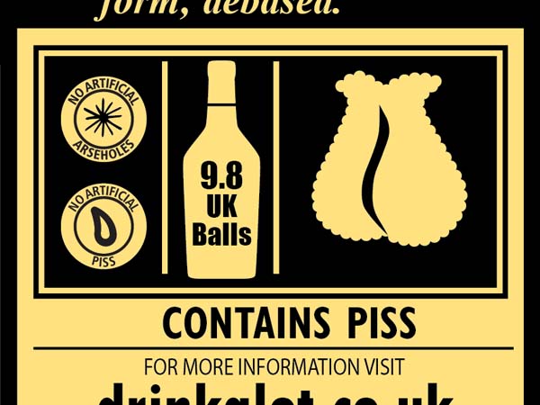
| Dominant Theme | A watercolour painting of a waterway in a countryside scene, surrounded by mostly black. | A rubbish tip with a dismal industrial view in the background. Various unthemed swearing. |
| Barcode Numbers Spell | 5011013100118 | 6 21 3 11 14 21 20 = FUCKNUT |
| Barcode Scans As | Baileys Original Cream Liqueur 17% vol 1L | RINGPIECE |
Comparison
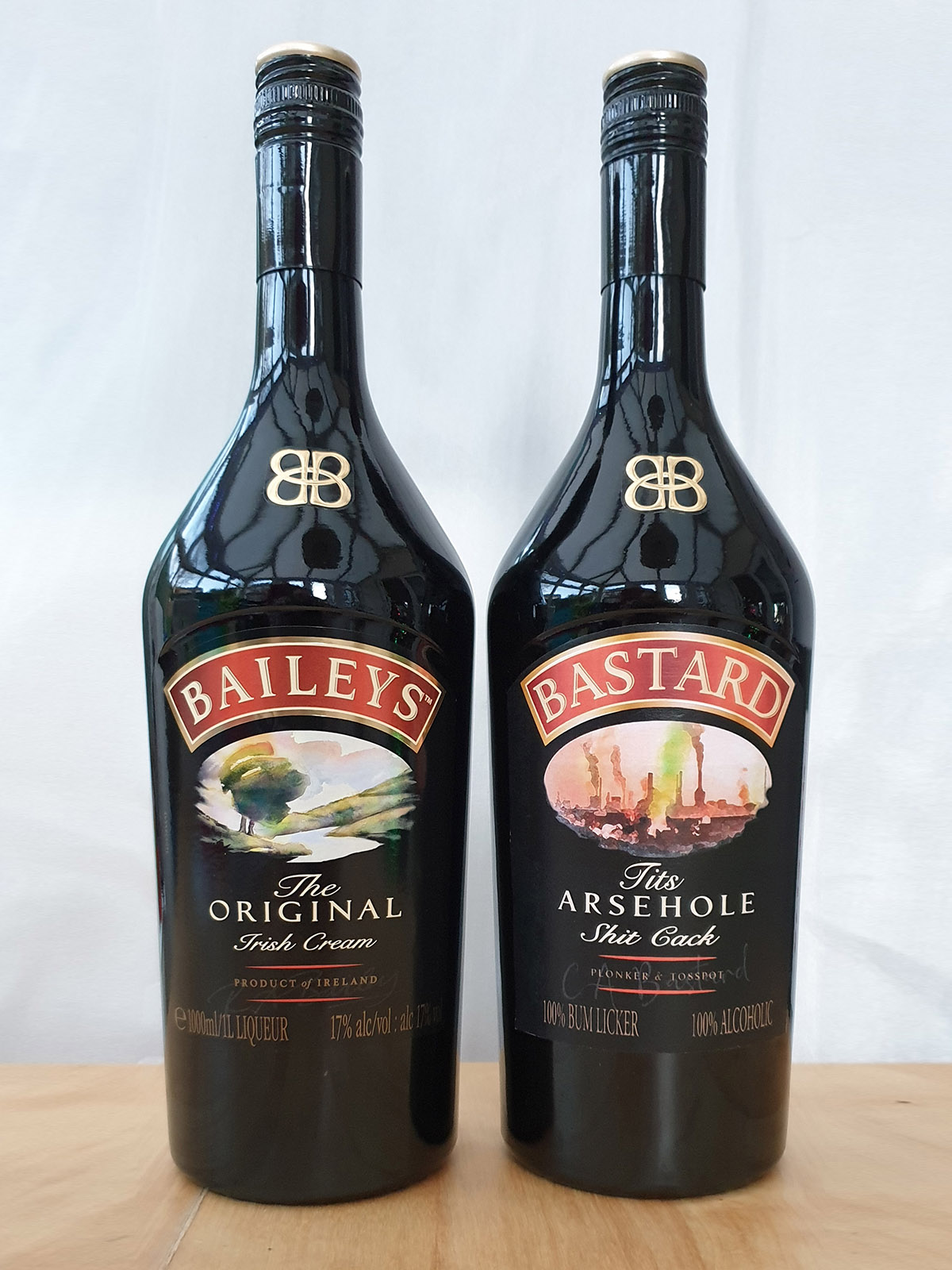
Development & Detail

In the Wild
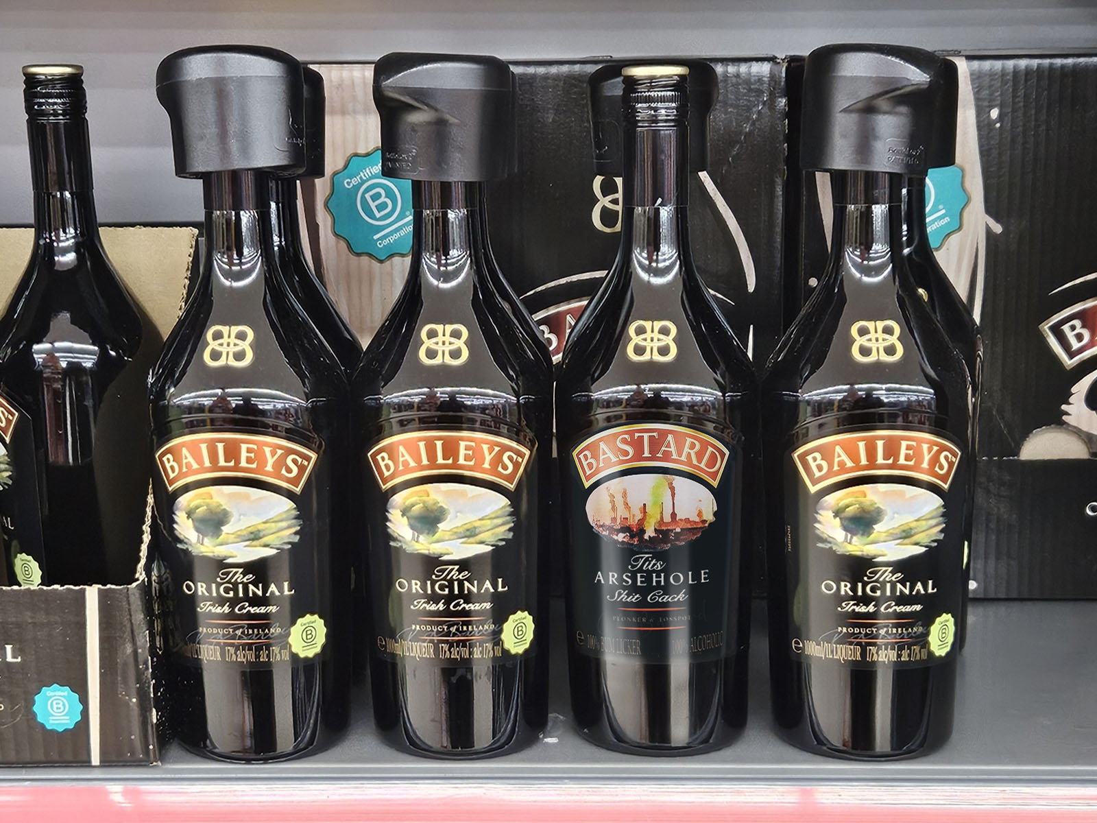
In store, in 2025. The original design had changed a little bit by then.
Notes
I gave a bottle of “Bastard” to my mum for one of her Christmas presents that year.